

Mastering Web Design Typography: 10 Essential Tips for Effective Type Usage
Optimizing typography isn't just about aesthetics; it's a strategic move that directly enhances your entire user interface. The careful selection of fonts, sizes, and spacing can significantly impact user experience and usability. When typography is optimized, it contributes to a visually pleasing layout that guides users intuitively through your content.
Well-considered typography choice enhances readability, making it effortless for users to absorb information. The right font size and line spacing prevent eye strain, ensuring that users can engage with your content comfortably. Consistency in font choices across headers, body text, and call-to-action buttons fosters familiarity and reinforces your brand identity.
Typography optimization also plays a pivotal role in responsive design. Fonts that scale appropriately across different devices maintain readability and coherence, regardless of whether your website is viewed on a desktop, tablet, or smartphone. This adaptability ensures a seamless experience for users across various platforms.
Moreover, typography influences the hierarchy of information on your interface. Clear headings, subheadings, and body text establish a logical flow, enabling users to navigate effortlessly and locate the content they're seeking. Effective typography highlights key elements and directs users' attention to important messages, thereby improving user engagement.
Remarkably, approximately 95% of websites predominantly rely on written language as their primary mode of content delivery. This underscores the pivotal role of typography in web design, as it directly influences user engagement and comprehension. With the majority of online experiences centred around written information, our approach to font selection takes on even greater importance, as it directly impacts how users perceive and interact with digital content.
What is website typography?
Website typography refers to the art and technique of selecting, arranging, and presenting fonts on a website. It involves choosing appropriate fonts, font sizes, spacing, and other typographic elements to enhance the readability, visual appeal, and overall user experience of the website's content.
Effective website typography not only makes the text easy to read but also contributes to the website's aesthetics and branding. It plays a crucial role in conveying information, setting the tone, and guiding users through the content of a website.
1. Use the Minimum Number of Fonts
In the realm of effective typography, the principle of using a maximum of 2 to 3 fonts emerges as a guiding light for achieving optimal readability and visual harmony. Whether it's web design, branding, or any form of visual communication, this approach holds undeniable value.
Selecting fonts depends on the context of your web design and the message you want to convey. However, three popular and versatile fonts that work well for various types of websites are:
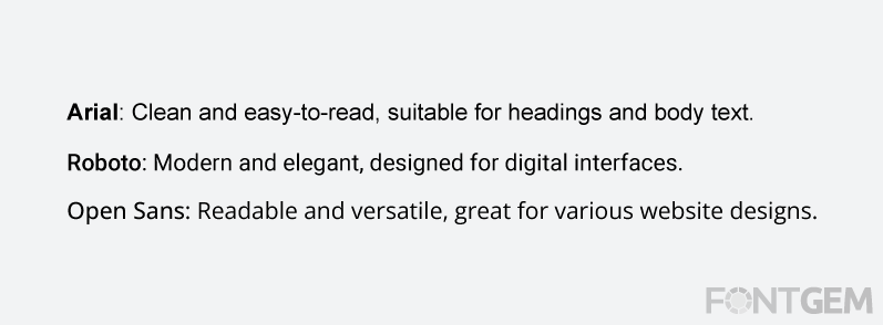
- Arial: A clean and easy-to-read sans-serif font that's widely available on different devices and platforms. It's a great choice for both headings and body text due to its simplicity and legibility.
- Roboto: This modern and elegant sans-serif font was designed specifically for digital interfaces. It offers a balance between friendly and professional, making it suitable for a wide range of websites.
- Open Sans: This font is known for its readability and versatility. It's clean, modern, and suitable for a wide range of website designs, making it a popular choice for both headings and body text.
At times, using only one font can be more than adequate.
When it comes to making websites, remember to keep it simple with fonts. Stick to just a few styles instead of using a lot. This way, everything looks neat and easy to read. It's like having a tidy room – not too many things cluttering up the space. Just a couple of fonts make your website look nice and organized, and people can quickly understand what you're saying. So, less is more when it comes to picking fonts for your website!
2. Choose fonts widely accepted as standard
When you dive into using font embedding services like Google Web Fonts or Typekit, you're exposed to a bunch of cool and unique fonts that can add a new and unexpected touch to your designs. But there's a catch. These interesting fonts can actually distract people from reading your content. Instead of focusing on the text itself, users might spend time thinking about the fonts they use.
It's like a double-edged sword. While these fonts can be eye-catching, they might end up taking away from the main point – the message you're trying to convey. People could get so caught up in trying to understand the font that they miss the actual information you're sharing.
The key is finding the right balance. Yes, using fun fonts can be exciting, but it's crucial to make sure they enhance your content rather than steal the spotlight. After all, the main goal is to make your message clear and easy to grasp, with fonts playing a supporting role, not the main attraction.
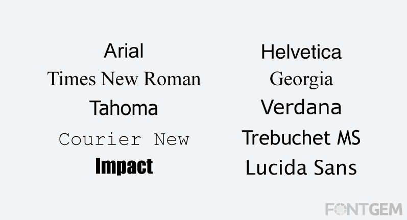
Here's a list of some standard web-safe fonts that are widely available on most computers and devices:
- Arial
- Helvetica
- Times New Roman
- Georgia
- Courier New
- Verdana
- Tahoma
- Trebuchet MS
- Impact
- Lucida Sans
3. Keep Line Length in Check
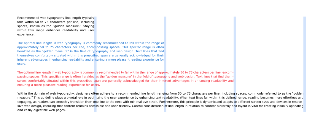
When you're adding content to your website, think about the length of the lines of words. You don't want them to be too long, like a stretched-out snake across the page. But they also shouldn't be too short, like tiny pieces of string. When you maintain a good line length, it's easier for people to read what you're sharing. Imagine reading a book where the lines are just the right size – it's comfortable and doesn't strain your eyes. So, make sure the lines of text on your website are like those comfortable book lines – not too long and not too short!
To make your text easy to read, aim for about 60 characters on each line. This is important for a good reading experience.
The ideal line length for body text ranges from 50 to 75 characters. Readability can be compromised with lines that are either too short or too long. Our extensive testing has shown that text line length can often render product or service descriptions needlessly challenging for users to comprehend.
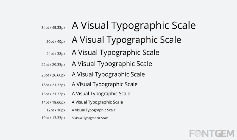
4. Use Standard Font Size
When it comes to designing your website, using a standard font size plays a significant role in creating an optimal reading experience for your visitors. Font size directly influences how easily your content can be read, ensuring that your message is effectively communicated.
Standard font sizes are carefully chosen to strike a balance between readability and visual appeal. When you opt for a standard font size, you're ensuring that your text is neither too small to strain your readers' eyes nor too large to overwhelm them. This consistency in font size across your website's various sections and pages makes navigation and comprehension seamless for users.
It's worth noting that different devices and screens vary in size, so what might seem like a readable font size on your computer might be too small on a mobile device. This is where standard font sizes come into play – they're designed to adapt well across different screen sizes and resolutions, guaranteeing that your content remains accessible and comfortable to read on any device.
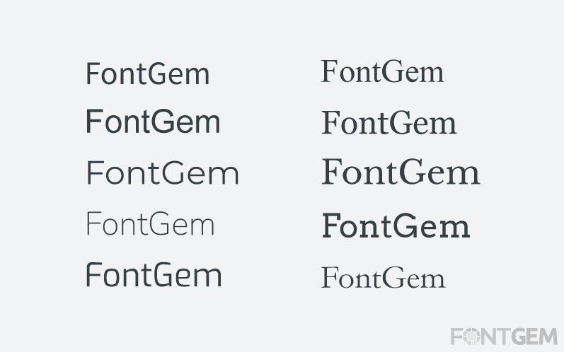
5. Select a Typeface Suitable for Different Sizes if needed
When you're getting things ready for your website and thinking about how the words will show up, remember that people will use all kinds of devices to look at your site. Some screens are big, some are small, and they're not the same. People will check out different things on your site, like buttons and headers, and these need words of different sizes.
So, it's a smart choice to pick a typeface, that is like the style of your words, that works well in all sizes. This makes it easy for everyone to read the words, whether they're big on a computer or really small on a phone. It's similar to how you want your clothes to fit nicely – you also want your typeface to fit well on all parts of your website!
When you're working on your website's design, it's advisable to avoid using cursive fonts. Cursive fonts are those that mimic fancy handwriting with connected letters. While they can look stylish, they might pose readability challenges, particularly on screens. People might struggle to decipher the words, which could lead them to leave your website or not engage with your content.
Opting for simpler and clearer fonts, instead of cursive ones, is a better choice for web design. These fonts resemble regular print, with each letter being distinct. They ensure that your words are easily readable, and users won't have to strain their eyes to understand the text. So, when you're making font choices for your website, it's a good practice to skip cursive fonts and go for fonts that offer straightforward and effortless readability.
6. Use fonts that show clear variations between their letters
Choose carefully when deciding how your words will look on your website. Pick fonts that ensure each letter stands out and is easy to recognize. Some fonts squeeze the letters together tightly, which can create confusion while reading. On the other hand, if you go for fonts where each letter is clearly distinct, it's like making sure your words don't become jumbled.
In the world of web design and typography, it's important to be aware that many widely used fonts can create confusion among readers when it comes to telling apart similar letters like "i" and "l". Ensuring that the font you choose for displaying text on your website allows readers to easily differentiate these almost identical characters is essential. This consideration contributes to a smooth reading experience for your website's visitors and prevents any potential confusion.
Imagine you're crafting a cool web design, kind of like creating a jigsaw puzzle. The letters in your words are like puzzle pieces, and you want each piece to fit nicely and stand out. By using fonts that have clear letter differentiation, your words become effortless to read. People won't have to squint or guess what the letters are. It's like having a smooth road for your readers to journey on your website – no bumps, no confusion, just simple and distinct words that everyone can easily understand!
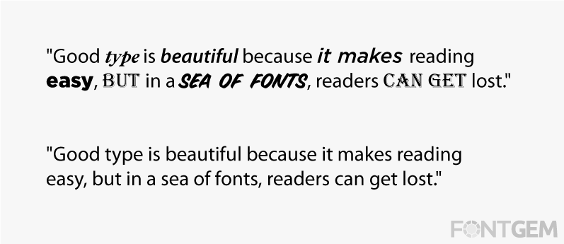
7. Steer Clear of All Capital Letters
It's best to avoid using ONLY CAPITAL LETTERS. It can give the impression that you're shouting in the online world! Additionally, it tends to be harder to read. Imagine someone who talks loudly all the time – it can be overwhelming. While it's alright to use capital letters for important parts like titles, using them for regular text isn't very reader-friendly. It's like having a friendly conversation versus raising your voice. So, remember to skip the all-caps style for your website content, ensuring that your words are comfortable and enjoyable for everyone to read!
8. Maintain Adequate Spacing Between Lines
To make reading easy on your website, make sure there's enough space between lines. When lines are squished together, it can be hard for our eyes to follow the words. It's like reading a book where the lines are too close – it feels cramped. But when you have some space between lines, it's like giving the words some room to breathe.
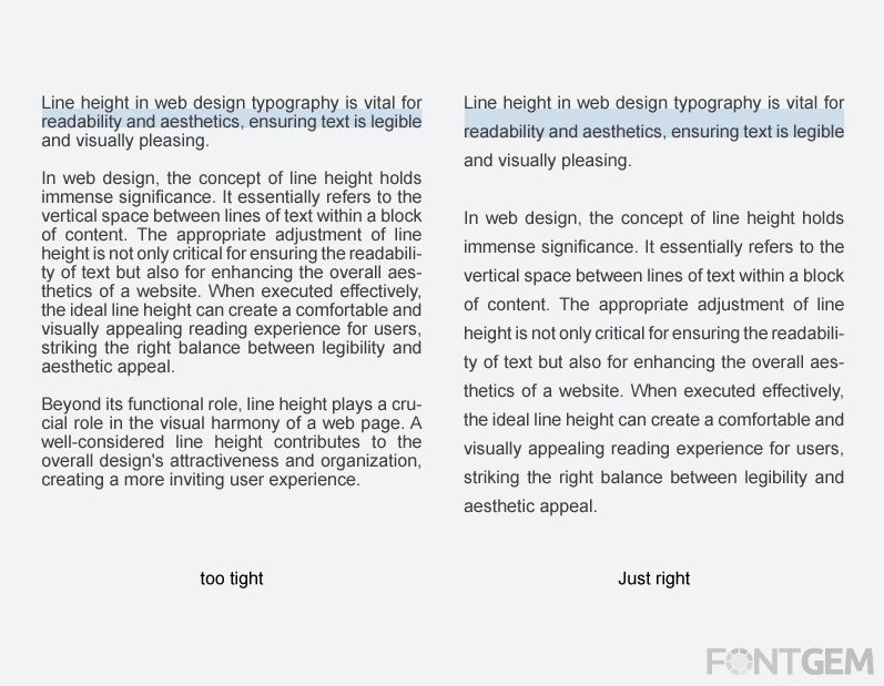
Think of it as arranging your words like a comfy chair. If the words are too close, it's like sitting in a chair that's too small. But with enough space between the lines, it's like having a nice, comfortable seat. So, remember to give your words some space on your website, and reading will be much smoother for everyone!
8. Ensure Appropriate Colour Contrast
To make sure your website's words are easy to read, it's important to use colours that stand out well. When the colour of the words contrasts nicely with the background, it's like making sure your message is clear and not hidden. If the colours are too similar, it can be like trying to find something in a messy room – confusing and frustrating.
Imagine if you wrote with a light colour on a light background or a dark colour on a dark background. It would be like trying to read in the dark! Using colours that contrast nicely, like dark letters on a light background or vice versa, makes reading comfortable for everyone. So, always think about the colours you're using to ensure your words pop out and catch the eye of your website!
The contrast ratio is how different the text and background appear. A higher ratio means the text is easier to read, while a lower one can make it harder. It's often written as numbers like "4:1" to show the difference in brightness. Following recommended ratios helps everyone read your content comfortably.
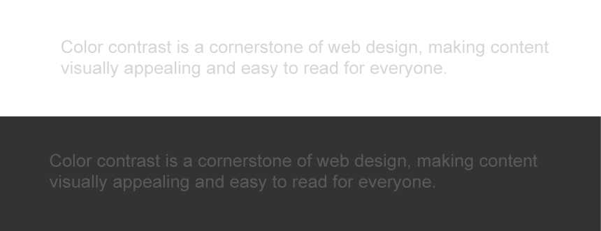 These lines show poor colour contrast, so the text is not easy to read
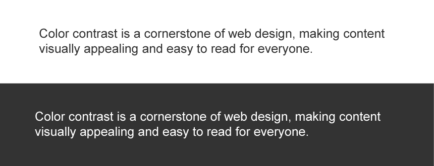 These lines show good colour contrast, so the text is easy to read
For shorter sections of text, it is advisable to maintain a contrast ratio of around 4:5:1 in relation to the background. On the other hand, for longer sections of text, the ideal contrast ratio should hover around 3:1 against its respective background. Adhering to these contrast guidelines contributes to a comfortable and user-friendly reading experience on your web page.
- For regular text (less than 18.66px or 14pt): Minimum contrast ratio of 4.5:1 against the background.
- For larger text (18.66px or 14pt and above) or bold text (more than 14pt): Minimum contrast ratio of 3:1 against the background.
9. Avoid using text that blinks
Adding blinking text to your website might seem fun, but it's actually not a good idea. Imagine trying to read something while the words keep flashing – it would be really distracting and hard to follow!
Sticking with stable text is much better. It's like reading a book where the words stay put on the page. This way, everyone can read smoothly and understand your message without any interruptions. So, it's best to skip the blinking text on your website and provide a more comfortable reading experience for your visitors!

Imagine you're reading a book, and suddenly some of the words start blinking on and off. It would be really distracting and make it hard to focus on the story. The same goes for websites. If you use blinking text, it can annoy visitors and make it difficult for them to read the information you're trying to share. It's like trying to have a conversation while someone keeps interrupting you – not very enjoyable! So, it's a good idea to abstain from using blinking text to create a smoother and more comfortable experience for your website visitors.
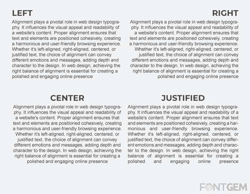
10. The Impact of Alignment on Text Readability
Alignment plays a crucial role in determining how easily text can be read. A well-organized website or web page is consistently aligned based on the content type. For example, when the text is a personal letter, it typically starts from the left corner. In contrast, headings and subheadings that aren't directly related to the content beneath them might be centred for better visual arrangement.
Typography holds a crucial role in design. Making the right font choices is key, as poor selections can divert users' focus from reading your content. It's essential to ensure that your typography is not only visually appealing but also highly readable, easily understandable, and legible to create a seamless and enjoyable reading experience for your audience.
Typography: Elevating Web Design for Seamless User Experiences
In the ever-evolving landscape of web design, mastering typography is not a mere choice but a strategic imperative. It is the linchpin that holds together the user interface, fostering a seamless and enjoyable user experience. The careful selection of fonts, sizes, and spacing isn't just about aesthetics; it's about communication, readability, and accessibility. As we've explored in this article, typography influences how users perceive, engage with, and comprehend digital content.
With approximately 95% of online experiences hinging on written language, our approach to typography becomes pivotal. By implementing the essential tips discussed here, web designers can not only enhance the visual appeal of their creations but also ensure that users can effortlessly navigate, read, and connect with the information presented. Typography isn't just a design choice; it's the language through which your website communicates. So, let's continue to refine and master this art, enriching the web with better, more user-friendly experiences for all
LEAVE A COMMENT
Categories
Recent Posts


0.0588