

Script and Cursive Styles of Typography: A Timeless Artistry
Historical Roots of Script Typography
Typography, as we know it today, has a rich and storied history, with script typography serving as one of its foundational elements. Understanding the historical roots of script typography is crucial in appreciating its enduring appeal and significance in contemporary design.
Ancient Scripts: The Precursors
Script typography finds its origins in the early written languages of humanity. These ancient scripts, etched onto stone tablets, papyrus, and vellum, were the precursors of the beautiful letterforms we use today. The hieroglyphics of ancient Egypt, the cuneiform of Mesopotamia, and the elegant Chinese calligraphy are just a few examples of these early script forms.
These ancient scripts were not just utilitarian; they were artistic expressions in their own right. The careful craftsmanship required to create these intricate symbols laid the foundation for the artistic exploration of script typography.
Renaissance and Calligraphy Revival
The Renaissance period marked a significant resurgence of interest in the art of calligraphy and script typography. This era, spanning from the 14th to the 17th century, witnessed a revival of classical learning and culture. Humanists of the time sought to revive the beauty of ancient scripts, not only for practical purposes but also as an aesthetic pursuit.
Scholars and scribes meticulously studied and reproduced the works of ancient calligraphers, leading to the development of various script styles such as Italic, Carolingian, and Blackletter. These styles not only served as practical writing forms but also became emblematic of the Renaissance's devotion to classical ideals and artistic expression.
The Influence of Handwriting
Intriguingly, script typography owes much of its charm to the very essence of handwriting. Unlike other typographic styles, script fonts mimic the fluidity and organic nature of human handwriting. In this regard, the art of handwriting has always been intimately intertwined with the development of script typography.
Handwriting variations across cultures and individuals have led to the diversity of script fonts we have today. Whether it's the graceful loops of Spencerian script or the bold strokes of Brush Script, each style draws inspiration from the nuances of human handwriting.
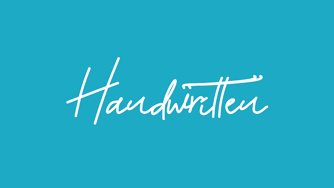
In essence, script typography is a testament to the human desire to infuse artistry into the written word. It bridges the gap between utility and aesthetics, and its historical roots continue to inspire designers and typographers to create elegant and expressive letterforms in the modern age.
Types of Script and Cursive Typography
In the realm of typography, script and cursive styles offer a vast playground for creative expression. These styles come in various forms, each possessing its own unique characteristics and applications. Let's explore the different types of script and cursive typography:
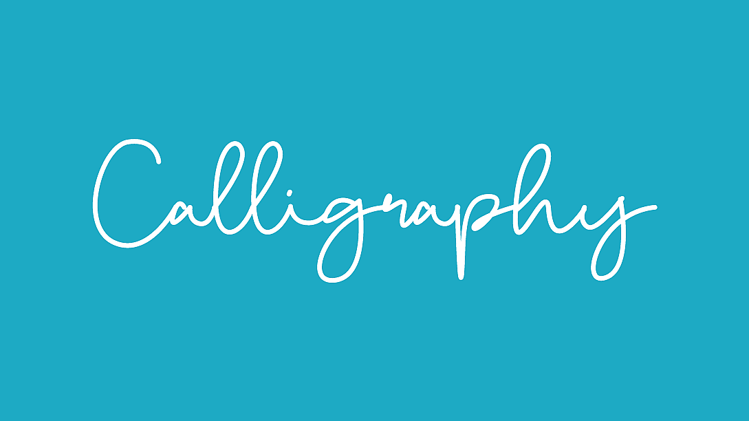
Classical Script
Characteristics:
Classical script typography embodies a sense of timeless elegance. It often features:
- Graceful, flowing letterforms with varying stroke thickness.
- Looped ascenders and descenders, add a sense of continuity.
- Serifs and ligatures that enhance its traditional appeal.
- A balanced combination of curves and straight lines.

Applications:
Classical script typography is often used for formal and traditional contexts, including:
- Wedding invitations and formal event stationery.
- Certificates, diplomas, and official documents.
- High-end branding and luxury packaging.
- Historical and fine art publications.
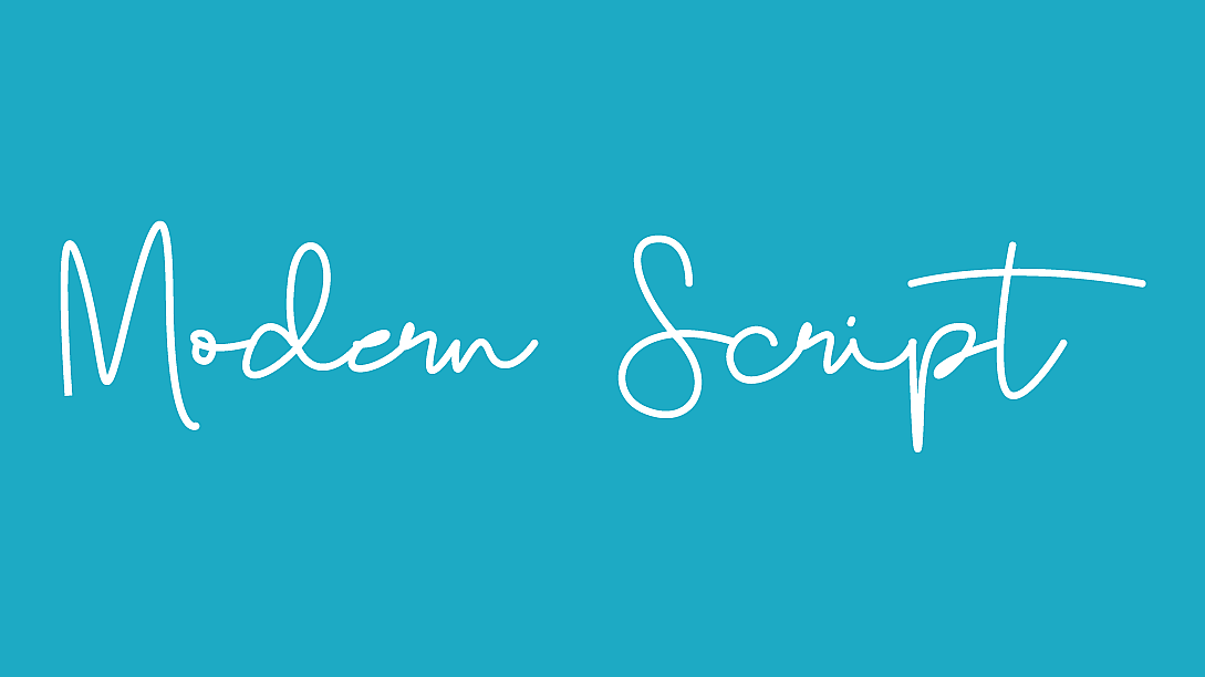
Modern Script
Characteristics:
Modern script typography embraces a contemporary aesthetic, characterized by:
- Sleek, fluid, and often monolinear letterforms.
- Minimalist or no serifs, giving it a cleaner and more streamlined appearance.
- Playful, free-flowing swashes and ligatures.
- A sense of casual sophistication.
Contemporary Usage:
Modern script typography is popular in a range of modern applications, such as:
- Logo design for fashion brands and lifestyle products.
- Packaging for cosmetics, gourmet foods, and artisanal goods.
- Contemporary wedding invitations and event materials.
- Web and app interfaces seeking a fresh, personalized feel.
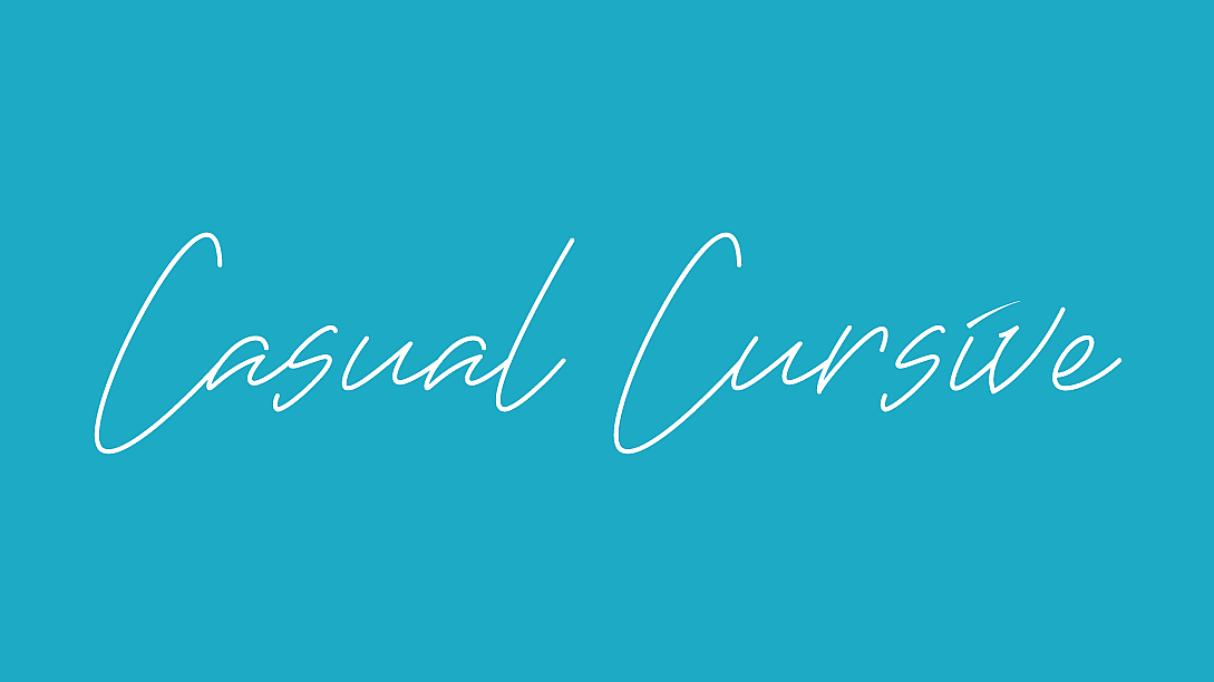
Casual Cursive
Characteristics:
Casual cursive typography exudes an informal, handwritten charm with features like:
- Natural variations in letter slant and size, mimic casual handwriting.
- Loose, unconnected letters or lightly connected characters.
- A lack of rigid structure, makes it appear spontaneous and approachable.
- A friendly, approachable vibe.
Informal Applications:
Casual cursive typography is well-suited for relaxed, approachable contexts, including:
- Informal personal correspondence and handwritten notes.
- Blogs, social media graphics, and digital content with a personal touch.
- Restaurant menus and chalkboard signage for a welcoming atmosphere.
- Children's books, playful branding, and creative projects.
Decorative Script
Characteristics:
Decorative script typography is the epitome of artistic expression, often featuring:
- Highly embellished and ornate letterforms.
- Elaborate swashes, flourishes, and decorative elements.
- Distinctive thematic or period-specific styles.
- A sense of opulence and grandeur.

Ornamental Usage:
Decorative script typography shines in contexts that demand a touch of extravagance and style, including:
- Theatrical posters and movie titles for period dramas.
- Luxury packaging for high-end products.
- Invitations to extravagant events and galas.
- Historical reenactments and themed events.
Understanding the nuances of these script and cursive typography styles is essential for designers, as it allows them to select the perfect typeface for a given project, aligning the visual identity with the intended message and audience. Whether conveying elegance, modernity, informality, or opulence, script typography is a versatile and powerful tool in the designer's toolkit.
Anatomy of Script and Cursive Typography
To truly appreciate and work with script and cursive typography effectively, it's crucial to delve into the intricate details of their anatomy. Understanding the elements that compose these typefaces is fundamental to both their creation and application. Let's explore the anatomy of script and cursive typography:
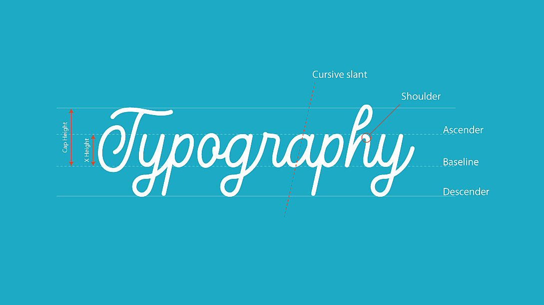
Letterforms
In script and cursive typography, letterforms are the building blocks of expression. These letterforms have distinct characteristics that define their style and personality. Key aspects include:
-
Ascenders and Descenders: In script fonts, ascenders (the parts of letters that extend above the x-height, like the top of 'l' or 'b') and descenders (the parts that dip below the baseline, as in 'p' or 'g') often have flowing, decorative elements that add grace and style.
-
Ligatures: Ligatures are special combinations of two or more letters that are crafted to flow together seamlessly. They create a sense of continuity in script typography and can enhance legibility and aesthetics.
-
Flourishes: Many script and cursive typefaces incorporate decorative flourishes. These ornamental additions can be seen in the form of graceful loops, curls, or tails, adding a sense of flair and artistry to the letterforms.
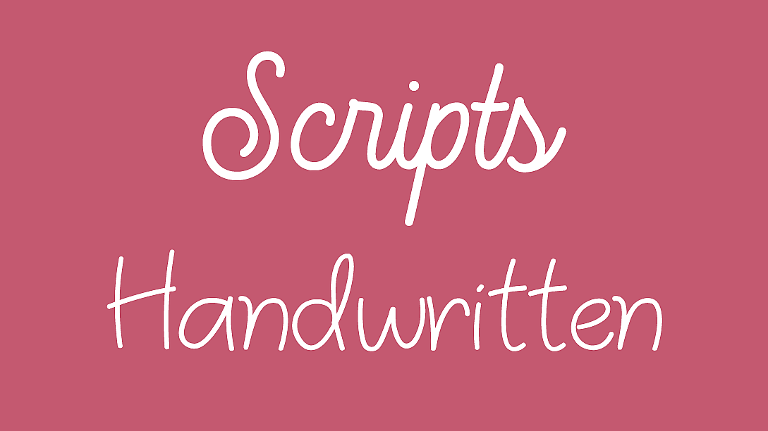
Script Fonts vs. Cursive Fonts
Script and cursive typography are closely related but have distinct differences:
-
Script Fonts: Script fonts are often more formal and structured. They typically have clear, separate characters with a calligraphic touch. These fonts are ideal for applications where a touch of elegance and tradition is desired.
-
Cursive Fonts: Cursive fonts, on the other hand, aim to replicate the fluidity of casual handwriting. They may have letters that flow into one another, imitating the natural cursive script. These fonts are well-suited for projects seeking a more personal and relaxed tone.
Understanding the differences between script and cursive fonts allows designers to choose the right style to convey the desired mood and message.
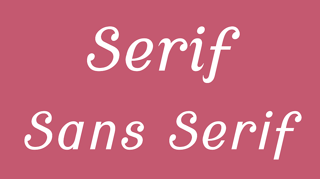
The Role of Serifs and Sans Serifs
While script and cursive fonts are known for their flowing, handwritten quality, they can also incorporate elements of serifs or remain sans serif. The choice of serif or sans serif can significantly impact the overall look and feel of the typography:
-
Serif Script Fonts: These fonts maintain the elegance of the script while adding serifs for a touch of formality. They are often used in contexts where readability and tradition are paramount.
-
Sans Serif Script Fonts: Sans serif script fonts eliminate serifs for a more modern and clean appearance. They are favoured for contemporary designs, where a sleek, minimalistic aesthetic is desired.
Balancing the use of serifs and sans serifs in script and cursive typography is an essential design decision, allowing designers to align the typography with the project's objectives and audience preferences.
Design Principles for Script and Cursive Typography
Script and cursive typography, with their intricate letterforms and flowing styles, require careful consideration and application of design principles to achieve both legibility and aesthetic appeal. Here are some essential design principles for working with script and cursive typography:
Legibility and Readability
While script and cursive fonts can be visually captivating, ensuring that the text remains legible and readable is paramount. Designers must consider the following:
-
Letter Spacing (Kerning): Adjusting the spacing between individual letters is crucial to prevent characters from running into each other or appearing too spaced out. Kerning ensures that each letter is distinct and readable.
-
Word Spacing (Tracking): Tracking refers to adjusting the space between entire words. Appropriate word spacing maintains a balanced rhythm and helps readers follow the text effortlessly.
-
Line Spacing (Leading): Adequate leading (the space between lines of text) is essential to prevent crowding and ensure that descenders from one line do not interfere with ascenders from the line below.
Kerning and Tracking
Kerning:
Kerning is the process of adjusting the space between individual letters to achieve better visual harmony. In script and cursive typography, kerning is particularly important to ensure that letter combinations flow smoothly and that ligatures (special character pairs) are well-executed. For instance, in a script font, the 'o' and 'e' might require tighter kerning than 't' and 'h.'
Tracking:
Tracking refers to adjusting the overall spacing between all the letters in a word or a block of text. In script and cursive typography, tracking can be adjusted to create a more open and airy feel or a tighter, denser appearance. Tracking is essential for maintaining consistent readability and aesthetics across a body of text.
Spacing and Leading
Spacing:
Proper spacing within and between letters, words, and lines is crucial for script and cursive typography. Too much space can make text appear disjointed, while too little space can lead to crowding and illegibility. Designers must strike a balance that complements the font's inherent characteristics and the intended message.
Leading:
Leading refers to the vertical spacing between lines of text. In script and cursive typography, sufficient leading ensures that descenders (parts of letters that extend below the baseline) do not clash with ascenders (parts that rise above the x-height) from the line above. This helps maintain readability and visual harmony.
Combining Script and Serif Fonts
In some design projects, it may be necessary to combine script or cursive fonts with serif fonts (those with small decorative lines at the ends of character strokes) for added contrast and readability. The choice of serif typefaces and their integration with script typography should be carefully considered to achieve a harmonious and visually pleasing composition.
Balancing Form and Function
Ultimately, the key to effective script and cursive typography is striking a balance between form and function. While these typefaces offer a wealth of aesthetic possibilities, they must remain functional and serve their intended purpose. Designers should continually assess how the typography enhances the overall design and message without sacrificing readability and clarity.
Applications and Use Cases
Script and cursive typography, with their unique charm and versatility, find applications in a wide range of design contexts. Let's explore some of the most common and creative use cases for these elegant typefaces:
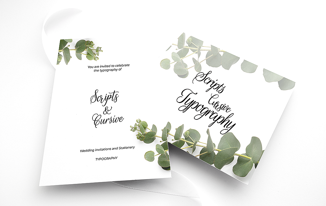
Wedding Invitations and Stationery
Script typography, with its inherent sense of romance and sophistication, is a perennial favourite for wedding invitations and stationery. It can convey the formality and elegance of the occasion, capturing the essence of a couple's unique style. From save-the-date cards to wedding programs, script typography adds a touch of timeless class to matrimonial designs.
Branding and Logo Design
Script and cursive fonts have a remarkable ability to infuse brands with personality and character. They are often used in logo design to create memorable and distinct brand identities. Businesses seeking a warm, personal, or artisanal feel turn to script typography to convey their values and connect with their target audience.
Editorial Design
In editorial design, script and cursive fonts can be employed for various purposes. Headlines and drop caps in editorial layouts benefit from the visual flair of script typography, drawing readers into articles and stories. These typefaces can also be used for quotes, pull-out text, and special feature sections, adding visual interest and personality to publications.
Digital Interfaces and UX
Script typography has not been left behind in the digital age. It is often used in user interfaces and user experience (UX) design to create a more personal and engaging digital experience. For instance, apps or websites with a friendly or casual tone may incorporate cursive fonts in headings or interactive elements to make users feel more at ease.
Art and Decorative Typography
Script and cursive typography are instrumental in the creation of decorative typographic art. Artists and designers use these typefaces to craft visually captivating posters, prints, and signage. These artworks often feature intricate lettering, flourishes, and embellishments that showcase the artistry of typography.
Challenges in Script and Cursive Typography
While script and cursive typography offer numerous creative possibilities, they also present challenges that designers must overcome to ensure successful execution:
Overcoming Legibility Issues
The inherent ornamental nature of script fonts can sometimes lead to legibility issues, especially in smaller font sizes or when used in large blocks of text. Designers must strike a balance between aesthetics and readability, often by choosing the right typeface and adjusting spacing and sizing.
Maintaining Consistency
Script typography can be challenging to maintain consistently, as it often involves intricate ligatures, swashes, and flourishes. Designers must ensure that the chosen font behaves consistently across various platforms and devices to maintain a cohesive brand or design identity.
Digital Challenges vs. Handcrafted Styles
Translating the nuances of handcrafted scripts into digital formats can be a complex task. Ensuring that the digital version retains the elegance and charm of the original handwritten style requires careful attention to detail.
Cross-Cultural Considerations
Script typography can have cultural connotations that may not be universally understood. Designers working on global projects must consider the cultural implications of script choices to avoid misinterpretation or unintended associations.
In navigating these challenges, designers harness the artistic potential of script and cursive typography while being mindful of the practical considerations that ensure successful design outcomes.
The Intersection of Tradition and Technology
The world of typography has witnessed a significant intersection of tradition and technology, and this synergy is particularly pronounced in the realm of both script and cursive typography. Designers and typographers now have access to an array of digital tools and resources to create, manipulate, and use script fonts effectively.
Digital Tools for Script Typography
The advent of digital design software has revolutionized the way script typography is created and manipulated. Designers can now choose from a vast library of script fonts or customize existing ones. Software tools like Adobe Illustrator, Adobe InDesign, and Glyphs allow for precise control over letterforms, ligatures, and swashes.
Custom Fonts and Typography Software
Custom script fonts have gained popularity as brands seek unique identities. Typography professionals and type foundries work to create bespoke script typefaces that align perfectly with a brand's personality and values. This process often involves collaborative efforts between designers, calligraphers, and type designers.
Typography software, such as FontLab and FontForge, empowers designers to create custom script fonts from scratch or refine existing ones. These tools offer comprehensive control over letter shapes, kerning, ligatures, and alternate characters, enabling designers to craft distinctive and cohesive typefaces.
Collaborative Typography Projects
The collaborative nature of script typography extends beyond individual designers. Typography professionals often collaborate with calligraphers and illustrators to create script fonts that capture the essence of handwriting. These collaborations result in typefaces that strike a harmonious balance between tradition and innovation.
Designers and calligraphers work hand in hand, with calligraphers providing the raw, hand-drawn letterforms, and designers translating them into digital fonts. This collaborative process ensures that the fonts retain the organic, artistic quality of handwriting while being versatile and functional in various design applications.
Contemporary Trends in Script Typography
Script typography, although rooted in tradition, evolves with design trends and cultural shifts. In the contemporary design landscape, several trends have emerged in the use of script fonts:
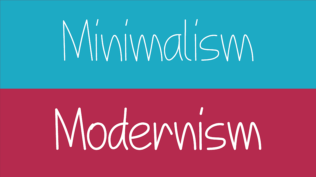
Minimalism and Modernism
Minimalist and modernist design approaches have influenced script typography. Clean lines, simplified letterforms, and restrained use of decorative elements create script fonts that are sleek and contemporary. These fonts find favour in designs that aim for simplicity and elegance.
Vintage and Retro Revival
The nostalgia for vintage aesthetics has led to a revival of script fonts reminiscent of mid-20th-century signage and advertising. These fonts evoke a sense of nostalgia and are often used in branding, packaging, and poster design to capture the charm of a bygone era.
Experimental and Abstract Script Typography
Some contemporary designers push the boundaries of script typography by experimenting with abstract and avant-garde styles. These fonts may incorporate unconventional shapes, distortions, and artistic interpretations to create truly unique and expressive typefaces.
Cultural and Regional Influences
The globalization of design has led to script fonts inspired by various cultures and regions. These typefaces draw from diverse calligraphic traditions, creating fonts that resonate with specific audiences and communicate cultural nuances.
As design trends continue to evolve, script typography remains a dynamic and adaptable form of artistic expression. Designers have the flexibility to choose from an array of script styles that align with their project's goals, whether it's evoking nostalgia, embracing modernity, or celebrating cultural diversity.
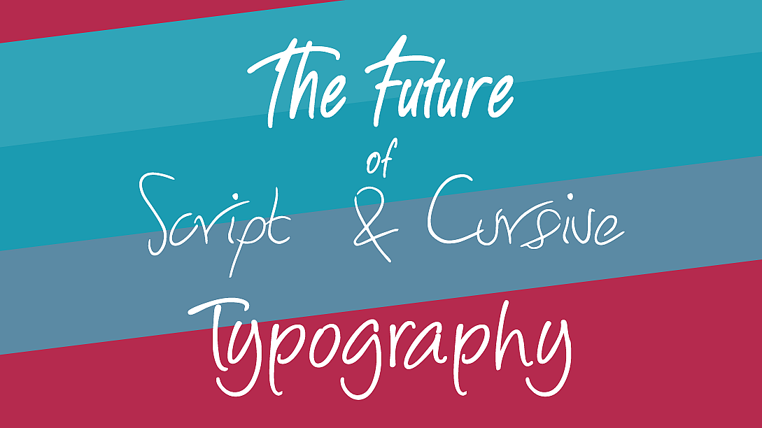
The Future of Script and Cursive Typography
The future of script and cursive typography is a testament to the enduring appeal of these elegant typefaces. Several factors will shape the trajectory of script typography in the coming years:
Evolving Design Trends
Design trends are ever-changing, and script typography will continue to adapt to these shifts. Designers will explore new ways to integrate script fonts into evolving design aesthetics, combining tradition with contemporary innovation.
The Role of AI in Typography
Artificial intelligence (AI) and machine learning are making significant strides in typography. AI-driven tools can analyze handwritten samples and generate custom script fonts with remarkable accuracy. This technology opens up exciting possibilities for designers to create personalized, handcrafted fonts at scale.
Preservation of Handwritten Styles
As digital communication becomes increasingly prevalent, there is a growing appreciation for the authenticity of handwritten styles. Designers may explore ways to integrate real handwriting into digital interfaces and printed materials, preserving the human touch in an increasingly digital world.
Script and cursive typography stand as timeless and adaptable forms of artistic expression within the ever-evolving world of design. These elegant typefaces bridge tradition and innovation, offering designers a versatile palette to create visually captivating and emotionally resonant designs. As design continues to evolve, script typography will remain an enduring and cherished element of visual communication.
LEAVE A COMMENT
Categories
Recent Posts


0.0203