Serif vs. Sans-Serif: Which Font Style Is Right for You?
Fonts play a crucial role in design, whether it be for a website, print media, or any other project. Choosing the right font style can have a significant impact on how the content is perceived by the audience. Two of the most popular font styles are serif and sans-serif.
Learn about the differences between these two font styles and help you determine which one is right for your project.
What are Serif and Sans-serif Fonts?
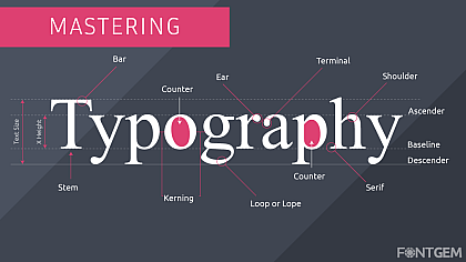
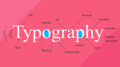
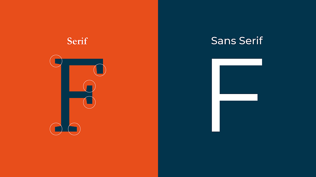
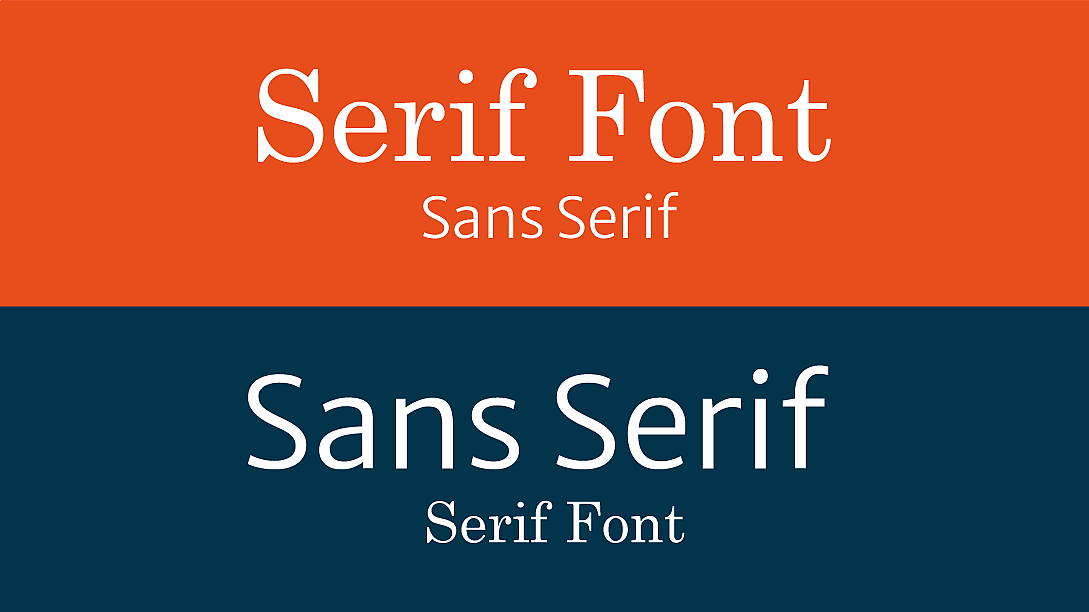
Serif fonts are characterized by small lines, known as serifs, at the end of each stroke. These fonts are typically seen as more traditional and formal, and they are commonly used in print media such as newspapers, books, and magazines. Times New Roman and Georgia are popular examples of serif fonts.
On the other hand, sans-serif fonts do not have these small lines and are characterized by their clean, modern look. They are often used in digital media, such as websites and mobile apps, and are generally considered more informal and casual. Popular examples of sans-serif fonts include Helvetica and Arial.
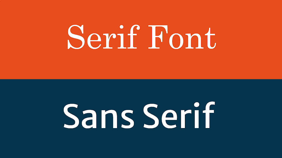
Now that we have a basic understanding of serif and sans-serif fonts let's dive deeper into their differences and when to use them.
Design and Aesthetics
Serif fonts are often used in designs where a classic, traditional feel is desired. They are also suitable for conveying a sense of elegance, sophistication, and professionalism. They work well for headings, body text, and other areas where readability is important. Serif fonts are also good for long-form content, such as articles and books, as they are generally easier to read in large chunks of text.
Sans-serif fonts, on the other hand, are commonly used in designs that require a modern, minimalist aesthetic. They are great for conveying a sense of simplicity and clarity, making them an excellent choice for websites, mobile apps, and other digital media. Sans-serif fonts are also suitable for designs that require a casual, friendly feel, such as marketing materials for a startup or small business.
Readability and Legibility
Readability and legibility are crucial considerations when choosing a font for any project. Readability refers to how easy it is to read the text, while legibility refers to how easy it is to distinguish each letter.
Serif fonts are generally considered more readable for long-form content as the serifs help guide the eye from one letter to the next, improving overall readability. However, serif fonts can be more difficult to read at smaller sizes, particularly on digital screens.
Sans-serif fonts, on the other hand, are typically more legible than serif fonts, particularly at smaller sizes. This is due to their clean and simple design, which makes each letter easy to distinguish. However, some sans-serif fonts may not be as readable for long-form content due to their lack of serifs.
Accessibility
Another important consideration when choosing a font style is accessibility. This includes factors such as colour contrast, font size, and spacing, all of which can affect how easy it is for people with visual impairments to read the text.
For accessibility purposes, sans-serif fonts are generally considered more suitable as they are easier to read in smaller sizes and on digital screens. However, serif fonts can still be used with proper consideration for accessibility, such as choosing a font with high contrast and appropriate spacing.
Branding and Identity
The choice between serif and sans-serif fonts can also play a significant role in branding and identity. Serif fonts are often associated with more traditional, established brands, while sans-serif fonts are associated with modern and innovative brands.
When choosing a font style for your brand, it is important to consider your audience and the image you want to convey. For example, if you are creating a logo or branding for a law firm or financial institution, a serif font may be more appropriate as it conveys a sense of professionalism and reliability.
On the other hand, if you are creating a logo for a tech startup or an online fashion store, a sans-serif font may be more suitable as it conveys a sense of modernity and innovation.
Combining Serif and Sans-Serif Fonts
One way to get the best of both worlds is to combine serif and sans-serif fonts in your design. This can create a unique and visually appealing look while also improving readability and legibility.
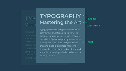
When combining serif and sans-serif fonts, it is important to choose fonts that complement each other well. Typically, this involves using a serif font for headings and a sans-serif font for body text. This helps create a visual hierarchy and makes it easier for readers to navigate the content.
Tips for Choosing Serif or Sans-Serif Fonts
Consider your audience: Think about who your target audience is and what kind of message you want to convey. Are you trying to appeal to a more traditional or modern audience?
Think about your brand identity: Your font choice should align with your brand identity and the values you want to convey. A serif font may be more appropriate for a classic, sophisticated brand, while a sans-serif font may be better for a modern, minimalist brand.
Consider readability: Think about the context in which your font will be used. For example, a serif font may be better for printed material, while a sans-serif font may be more readable on a screen.
Consider accessibility: Make sure your font choice is accessible to all readers, including those with visual impairments. This means choosing a font that is easy to read and has sufficient contrast with the background.
Experiment with different combinations: Try out different combinations of serif and sans-serif fonts to see what works best for your design. Consider factors like font size, weight, and spacing to create a balanced and visually appealing design.
Choosing between serif and sans-serif fonts can be a daunting task, but understanding their differences and considering your project's specific needs can help make the decision easier. Both font styles have their strengths and weaknesses, and the key is to find the one that best fits your project's aesthetic, readability, and accessibility requirements.
Ultimately, the choice between serif and sans-serif fonts is a subjective one that depends on the specific needs of your project. By considering your audience, brand identity, readability, and accessibility, and experimenting with different combinations, you can make an informed decision and create a visually appealing and effective design that engages and communicates with your audience.

