

Typeface vs. Font: Understanding the Fundamental Difference in Typography
Typography is an art that silently communicates with us every day. Whether we are reading a book, scrolling through a website, or perusing a menu at a restaurant, the choice of typeface and fonts plays a crucial role in shaping our experience and understanding of the content. Yet, for many, the terms "typeface" and "font" are often used interchangeably, leading to confusion.
We will delve into the world of typography and explore the fundamental distinction between typefaces and fonts. Understanding this difference is essential for designers, writers, and anyone involved in visual communication. By the end of this journey, you will have a clear grasp of what makes typefaces and fonts unique, and how their judicious use can elevate your design and communication efforts.
So, let's embark on this typographic adventure, starting with a closer look at what exactly a typeface is.
II. What is a Typeface?
Typography, as an art form and a means of communication, has a rich history dating back to the invention of the printing press by Johannes Gutenberg in the 15th century. At its core, typography revolves around two essential elements: typefaces and fonts. Let's begin by exploring what a typeface is and its significance in the world of design and communication.
Definition of a Typeface
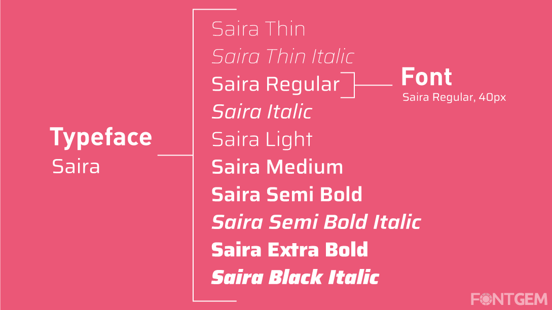
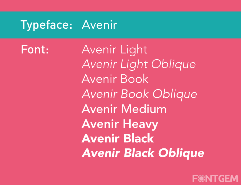
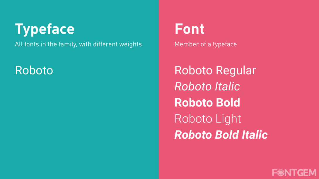
A typeface, often referred to as a "font family," is a collection of characters that share a consistent and coherent design. These characters encompass letters, numbers, punctuation marks, and symbols. What sets a typeface apart is its distinctive visual style, which includes factors such as the shape of the characters, their proportions, and the overall aesthetic.
Historical Context of Typeface Development
To appreciate the concept of a typeface fully, we must travel back in time to the origins of typography. Before the digital age, typefaces were created as physical pieces of metal or wood, each with a unique design. These physical representations were used in printing presses to produce books, newspapers, and other printed materials.
The development of typefaces evolved alongside the art of printing, with various type designers and foundries contributing to the vast array of typefaces we have today. Each typeface was meticulously crafted, with its own personality and characteristics, making it suitable for specific applications and conveying different moods or messages.
Importance of Typeface Characteristics
The characteristics of a typeface are the key to its identity and usability. These characteristics include:
-
Serif or Sans-serif: Typefaces can be categorized into serif and sans-serif. Serif typefaces have decorative strokes at the ends of characters, while sans-serif typefaces lack these embellishments. This differentiation influences readability and the overall feel of the text.
-
Weight and Style: Typeface families often include various weights (e.g., regular, bold, italic) and styles (e.g., condensed, extended). These variations provide flexibility in design and allow for emphasis or hierarchy in text.
-
X-Height and Proportions: The x-height is the height of lowercase letters in a typeface. Different typefaces have varying x-heights and proportions, which impact readability and aesthetics.
-
Kerning and Letter Spacing: Kerning refers to the adjustment of space between individual characters to ensure even spacing and pleasing visual harmony. Proper letter spacing is essential for legibility.
-
Ligatures and Special Characters: Some typefaces include ligatures (combined characters) and special characters, enhancing the typography's elegance and versatility.
Understanding these characteristics is crucial when selecting a typeface for a design project, as they directly influence the message's tone, readability, and visual appeal.
Let's explore what fonts are and how they relate to typefaces, further clarifying the distinction between these two fundamental elements of typography.
III. What are Fonts?
Now that we have a comprehensive understanding of typefaces, it's time to explore the concept of fonts and their role in the world of typography.
Definition of Fonts
Fonts are digital files or software applications that encompass a specific style, weight, and size within a typeface family. In essence, fonts are the digital tools that allow us to access and utilize typefaces for various design and communication purposes. Think of fonts as the practical manifestations of typefaces in the digital realm.
Relationship Between Typefaces and Fonts
The relationship between typefaces and fonts can be a source of confusion. To clarify this relationship, consider typefaces as the overarching design concept, while fonts are the practical implementations of those designs. A single typeface can have multiple fonts associated with it, each representing a different style or weight.
For example, if we take a popular typeface like "Helvetica," it encompasses a typeface family. Within this family, you may find fonts like "Helvetica Regular," "Helvetica Bold," and "Helvetica Italic." Each of these fonts retains the distinctive characteristics of the Helvetica typeface but with variations in style or weight.
Variations Within Fonts
Fonts, as digital entities, come in various forms and formats. Some common variations within fonts include:
-
TrueType Fonts (TTF): These fonts are commonly used in both Windows and Mac operating systems. They are highly versatile and can be used across a wide range of design applications.
-
OpenType Fonts (OTF): OpenType fonts are a more recent format that offers advanced typographic features, such as ligatures, alternate characters, and expanded language support. They are widely used in professional design projects.
-
PostScript Fonts: This older font format is less commonly used today but was prevalent in the past, especially in the field of desktop publishing.
-
Web Fonts: These fonts are specifically optimized for use on websites, ensuring fast loading times and consistent rendering across different browsers and devices.
-
Variable Fonts: A recent innovation, variable fonts, allows for dynamic adjustments of weight, width, and other characteristics within a single font file. They are highly efficient for responsive web design and flexible typography.
Understanding the variety of fonts available and their compatibility with different design tools and platforms is essential for designers and typographers.
With a clear grasp of what typefaces and fonts are and how they relate to each other, let's proceed to highlight the key differences between typefaces and fonts.
IV. Typeface vs. Font: Key Differences
The distinctions between typefaces and fonts are subtle yet vital. These differences may seem trivial to the untrained eye, but they have a significant impact on the world of design and communication.
1. Digital vs. Conceptual
-
Typeface: Typeface is a conceptual, design-based entity. It represents a specific style, character set, and visual identity created by a type designer. Typefaces exist as ideas and concepts.
-
Font: Font, on the other hand, is the practical, digital implementation of a typeface. Fonts are files or software that allow users to access and use a particular style or weight from a typeface family. Fonts are tangible and functional.
2. The Role in Design
-
Typeface: Typefaces define the visual identity and aesthetics of text. They determine the style, mood, and tone of the typography, making them critical in design decisions.
-
Font: Fonts are the tools that designers use to apply the chosen typeface in practice. They dictate the size, weight, and style of text within a design project. Fonts facilitate the execution of typographic choices.
3. Typeface Universality
-
Typeface: A typeface remains consistent in its design across different sizes and applications. The core visual identity of a typeface remains intact, ensuring coherence.
-
Font: Fonts can vary in size, style, and weight while maintaining the underlying typeface's design principles. This flexibility allows fonts to adapt to specific design requirements.
4. Licensing and Usage
-
Typeface: Typefaces themselves are typically not subject to licensing restrictions. Designers and type enthusiasts can explore and appreciate typefaces freely.
-
Font: Fonts, being digital assets, often come with licensing agreements. Users must adhere to these agreements when embedding fonts in design projects, especially for commercial use.
5. Accessibility and Technology
-
Typeface: Typefaces are independent of technology and can exist in analogue forms, such as in printed books and signage.
-
Font: Fonts are inherently tied to digital technology and are essential for digital media, including websites, apps, and digital publishing.
6. File Format
-
Typeface: Typefaces do not have a specific file format. They are conceptual and can be designed in various ways.
-
Font: Fonts are digital files that come in specific formats like TrueType (TTF), OpenType (OTF), and more. These formats are compatible with software and hardware for rendering text.
Understanding these differences is crucial for designers, as it allows them to make informed decisions when selecting and applying typefaces and fonts to their projects. We will look at practical considerations for choosing the right typeface and font combinations to enhance design and communication.
V. Selecting the Right Typeface and Font
Choosing the appropriate typeface and font combinations is a critical aspect of design and communication. The selections you make can greatly influence the readability, aesthetics, and overall impact of your project. Here are some practical considerations for making informed choices:
Considerations for Choosing the Appropriate Typeface
-
Audience and Purpose: Understand your target audience and the purpose of your design. Different typefaces convey various emotions and messages. For instance, a playful typeface may be suitable for a children's book but inappropriate for a legal document.
-
Readability: Prioritize readability. Ensure that the typeface you select is legible at the intended size and in the chosen context. Consider factors such as line spacing, character spacing, and contrast.
-
Consistency: Maintain consistency in your design. Use a limited number of typefaces to create a cohesive visual identity. Too many typefaces can lead to a cluttered and confusing design.
-
Hierarchy: Establish a typographic hierarchy by varying the size, weight, and style of type. This helps readers distinguish between headings, subheadings, and body text, guiding them through the content.
-
Contrast: Create contrast between typefaces to emphasize key information. Pair a bold, attention-grabbing headline typeface with a more subdued body text typeface for balance.
Factors to Keep in Mind When Selecting Fonts
-
Compatibility: Ensure that the chosen fonts are compatible with the software and platforms you are using for your project. Not all fonts are web-safe, so consider web fonts for online content.
-
Licensing: Be aware of font licensing restrictions. Some fonts are free for personal use but require a license for commercial projects. Respect copyright and licensing agreements.
-
Accessibility: Choose fonts that are accessible to a wide audience. Consider factors like high contrast and legibility, particularly for users with visual impairments.
-
Responsive Design: If designing for digital platforms, select fonts that work well in responsive design. Variable fonts, for example, can adapt to different screen sizes and orientations.
Examples of Effective Typeface/Font Pairings
-
Serif and Sans-serif Pairing: Combine a serif typeface for headings with a sans-serif typeface for body text to create a classic and readable design.
-
Complementary Styles: Pair a modern, minimalistic typeface with a handwritten or script font for a stylish and engaging contrast.
-
Contrasting Weights: Use a heavy, bold font for headings and a lighter, regular font for body text to create visual interest and hierarchy.
-
Serif and Slab Serif Combo: Combine a traditional serif typeface with a slab serif font to convey a sense of heritage and solidity.
-
Geometric and Humanist: Pair a geometric sans-serif with a humanist sans-serif to create a harmonious balance between modernity and warmth.
-
Monospaced and Proportional: Combine a monospaced font for code or technical information with a proportional font for body text for clear differentiation.
In essence, selecting the right typeface and font combinations involves a delicate balance of aesthetics, functionality, and message conveyance. It's an art form that requires a keen eye for design principles and a deep understanding of the nuances of typography.
Typography is not merely a technical aspect of design; it is a powerful language that speaks to the reader's subconscious. The nuances of typefaces and fonts are integral to effective communication and design. In this article, we've explored the critical difference between typefaces and fonts and their respective roles in the world of typography.
In your future projects, consider how the choice of typeface and font can influence the perception and impact of your work. Embrace the art of typography, for it is a powerful tool in the hands of those who seek to communicate with clarity and creativity.
LEAVE A COMMENT
Categories
Recent Posts


0.0399