

What is Typography? A Guide for Beginners
Typography, a Fusion of Art and Communication
Typography is the art and technique of arranging type to make written language legible, readable, and visually appealing. It's a dynamic field that plays a pivotal role in design, advertising, and communication. To appreciate the significance of typography in modern web design, let's delve into its origins and evolution through the ages.
The Definition of Typography
At its core, typography involves selecting and arranging typefaces (fonts) to convey a message effectively. It encompasses various elements like typeface choice, spacing, sizing, and colour. Typography is not just about letters and words; it's about creating a visual language that evokes emotions and communicates ideas.
A Brief Glimpse into Typography's Origins
Typography finds its roots in ancient civilizations, where written communication took diverse forms, from hieroglyphics in ancient Egypt to runic inscriptions in Scandinavia. However, it wasn't until Johannes Gutenberg's groundbreaking invention, the printing press, in the 15th century that typography as we know it today began to take shape.
Evolution through the Ages: A Historical Journey
The Renaissance period witnessed the birth of typographic principles, thanks to pioneers like Aldus Manutius, who introduced italic type and established standards for punctuation and text layout. As centuries passed, typography continued to evolve, influenced by technological advancements and cultural shifts.
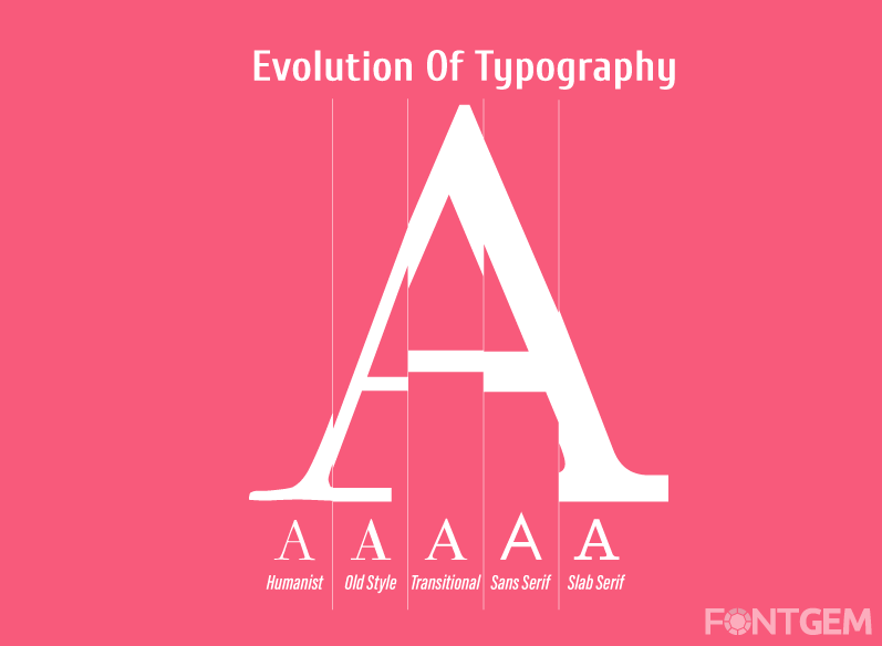
In the 20th century, the digital age revolutionized typography once again, with the advent of digital fonts and desktop publishing. Today, in the age of the internet, typography has found a new canvas on the web, where it plays a crucial role in shaping user experiences.
Continue reading to explore why typography remains relevant and how it impacts the design of websites and digital interfaces.
2. Why is typography important?
Typography is far more than just selecting pretty fonts for your website. It holds a profound influence over how users perceive, interact with, and remember your content. Understanding why typography is important is fundamental to crafting a successful web design.
The Impact of Typography on User Experience
User experience (UX) is at the heart of web design, and typography plays a pivotal role in shaping it. Here's how:
-
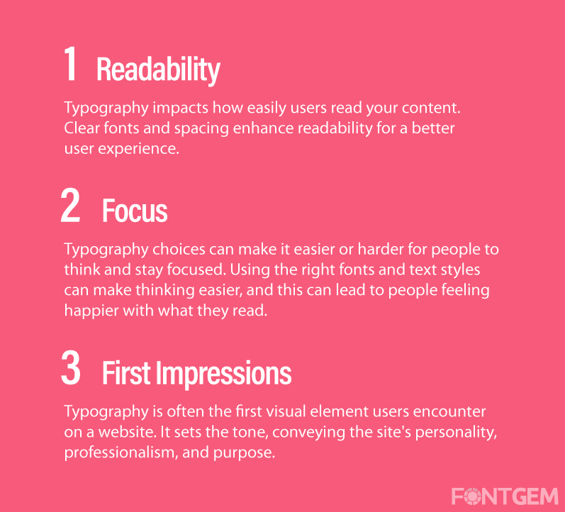
Readability: Typography directly affects how easily users can read and comprehend your content. Legible fonts and proper spacing enhance readability, making it effortless for visitors to consume your information.
-
Focus: Typography choices can make it easier or harder for people to think and stay focused. Using the right fonts and text styles can make thinking easier, and this can lead to people feeling happier with what they read.
-
First Impressions: Typography is often the first visual element users encounter on a website. It sets the tone, conveying the site's personality, professionalism, and purpose.
Typography's Role in Brand Identity
For businesses and brands, typography is a potent tool for establishing and reinforcing identity. Consider these aspects:
-
Consistency: A well-defined typographic system ensures consistency across all brand materials, from websites to print collateral. This consistency fosters brand recognition.
-
Personality: Typography can express a brand's personality, whether it's formal, playful, or modern. The choice of typeface should align with the brand's values and target audience.
-
Uniqueness: Custom typography or distinctive font pairings can set a brand apart from competitors, leaving a lasting impression.
Legibility vs. Readability: Unraveling the Nuances
Legibility and readability are often used interchangeably, but they have distinct meanings:
-
Legibility: Refers to how easily individual characters are distinguishable from each other. It's critical for small font sizes or decorative typefaces.
-
Readability: Encompasses the overall ease of reading a block of text. Factors like line length, spacing, and font choice influence readability.
Emotional Resonance through Typography
Typography has the power to evoke emotions and convey messages beyond words. Here's how:
-
Expressive Fonts: Script fonts may convey elegance and sophistication, while bold sans-serif fonts can communicate strength and modernity.
-
Colour and Typography: The interplay of typography and colour can amplify emotions. For instance, warm colours paired with an inviting font can create a friendly and welcoming atmosphere.
Understanding the importance of typography in web design is the first step toward harnessing its potential.
Moving forward, we'll explore the various elements of typography that designers manipulate to create effective visual communication.
3. The different elements of typography
Deconstructing Typography: Key Elements
Typography is a multifaceted discipline, composed of several essential elements that designers manipulate to craft compelling visual communication. To create effective typography for your website, it's crucial to understand these key elements:
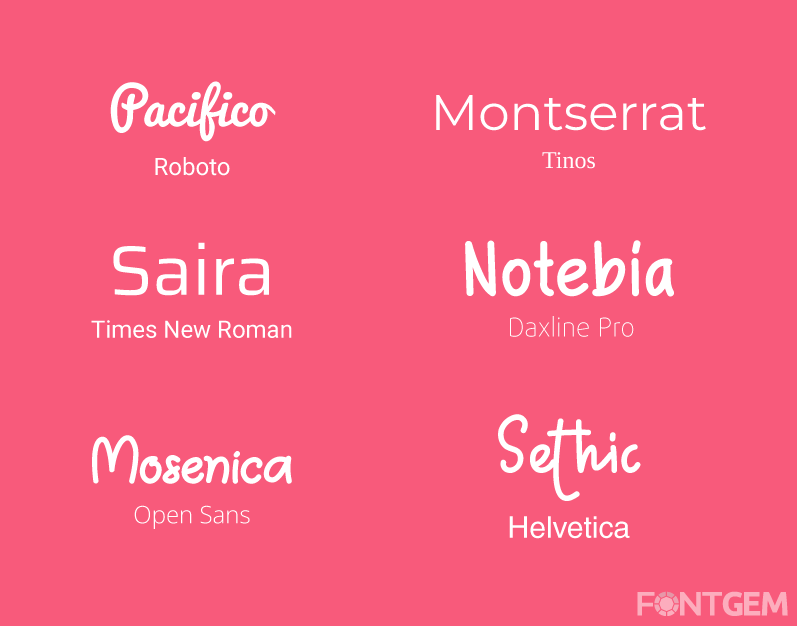
Typeface Classification: Serif, Sans-serif, Script, and More
Typefaces are the building blocks of typography. They can be broadly categorized into several groups, each with its unique characteristics:
-
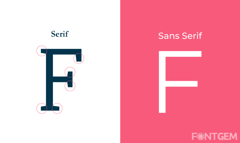
Serif: Serif fonts have small decorative strokes at the ends of characters. They are often associated with tradition, elegance, and formality.
-
Sans-serif: Sans-serif fonts lack these decorative strokes, resulting in a cleaner and more modern appearance. They are commonly used for digital interfaces due to their readability on screens.
-
Script: Script fonts mimic cursive handwriting and can evoke a sense of elegance or informality, depending on the style.
-
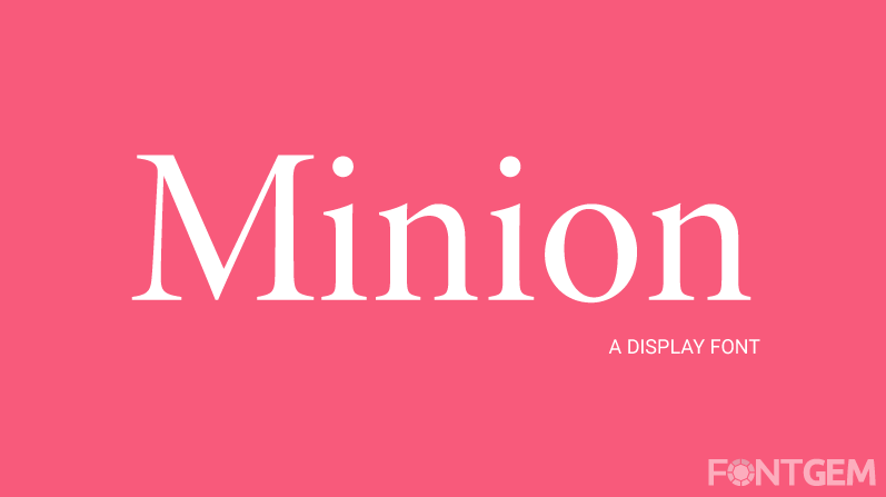
Display: Display fonts are bold and eye-catching, designed for use in headings and logos. They are not suitable for long blocks of text due to their decorative nature.
-
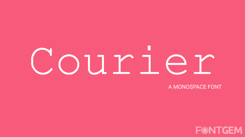
Monospace: Monospace fonts have equal spacing between characters, making them ideal for code and fixed-width text.
Typeface Anatomy: Understanding Letterforms
To appreciate typography fully, you must grasp the anatomy of letterforms. Here are some fundamental terms:
-
Baseline: The imaginary line upon which most characters sit.
-
X-height: The height of lowercase letters, excluding ascenders and descenders.
-
Ascender: The part of a character that extends above the x-height, such as the top of a lowercase "h."
-
Descender: The part of a character that extends below the baseline, such as the tail of a lowercase "g."
-
Counter: The enclosed or partially enclosed space within letters, like the circular area inside an "o."
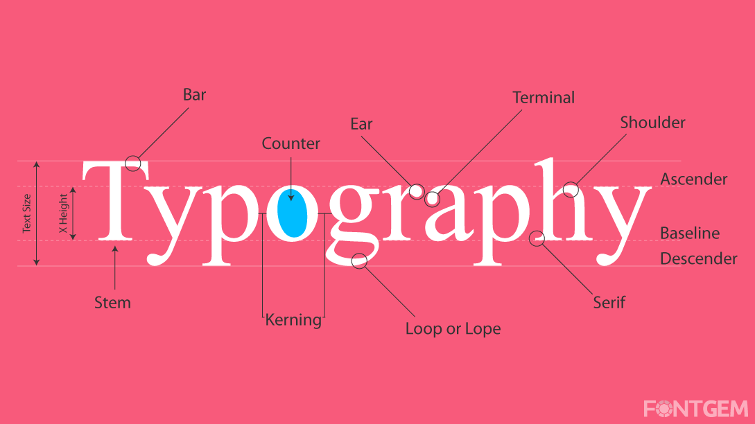
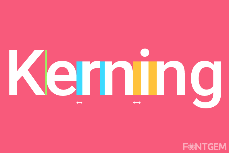
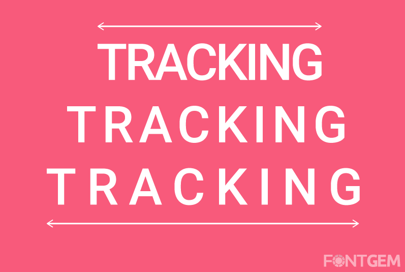
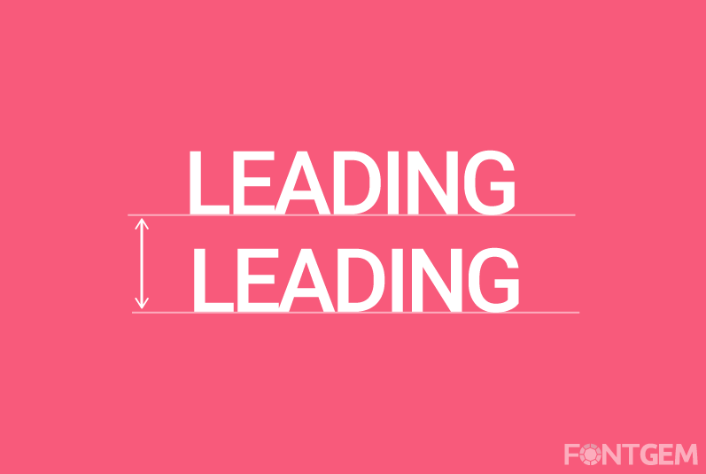
Kerning, Tracking, and Leading: Spacing Matters
Spacing plays a pivotal role in typography. Three key aspects to consider are:
-
Kerning: Kerning involves adjusting the space between individual character pairs to ensure even spacing and eliminate awkward gaps.
-
Tracking: Tracking, also known as letter spacing, refers to the consistent adjustment of space between all characters in a block of text.
-
Leading: Leading is the vertical space between lines of text. Proper leading ensures readability and prevents lines of text from feeling cramped.
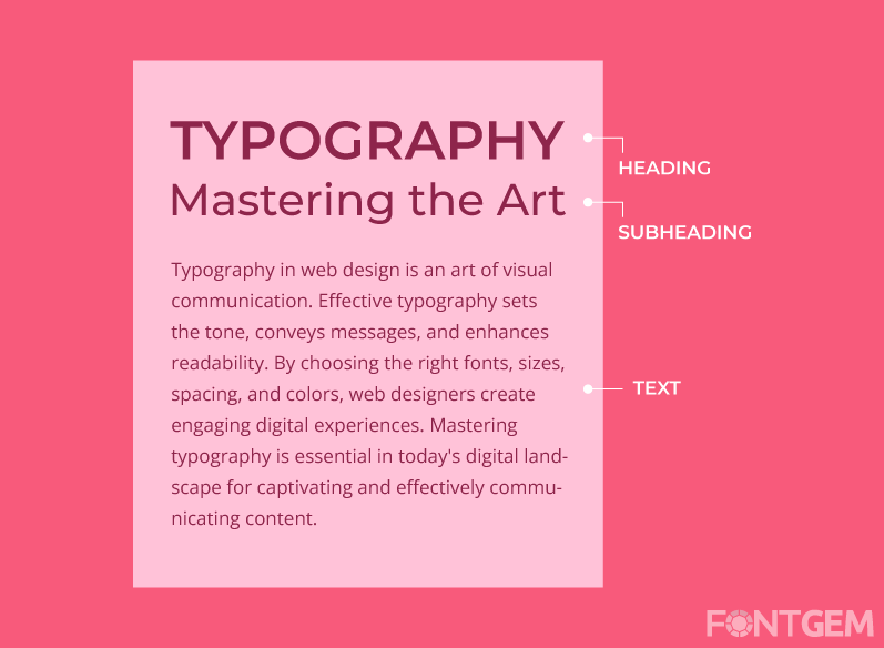
Font Weights and Styles: Crafting Visual Hierarchy
Typefaces often come with a variety of weights and styles, such as bold, italic, light, and more. These options allow designers to establish a visual hierarchy within their content.
-
Hierarchy: Using different font weights and styles for headings, subheadings, and body text helps guide the reader's eye and emphasize important information.
-
Contrast: Contrasting fonts or styles can create visual interest and draw attention to specific elements.
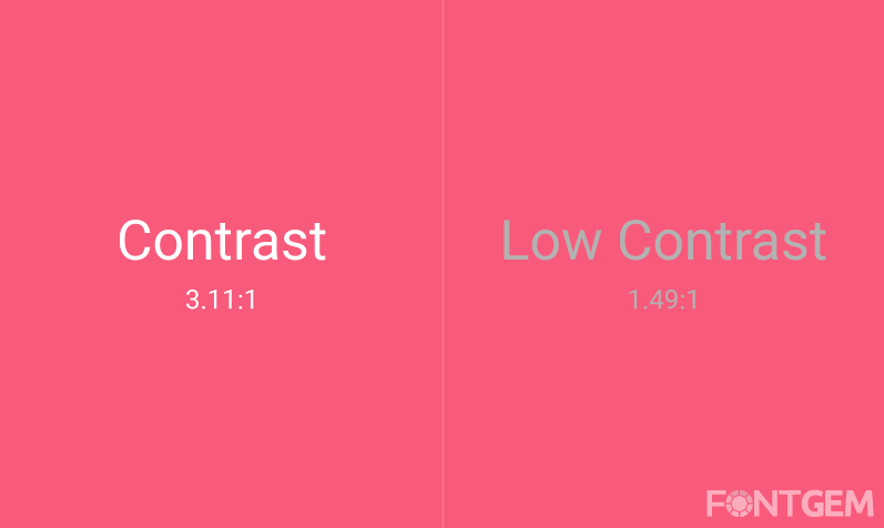
Colour and Typography: A Marriage of Visual Elements
Typography doesn't exist in isolation; it interacts with colour to convey messages and emotions effectively. The choice of font colour, background colour, and contrast levels can significantly impact the overall aesthetic and readability of your website.
Understanding these fundamental elements of typography is crucial as they serve as the building blocks for creating visually appealing and effective web design.
Now let us explore how to choose the right typeface for your website, considering factors like brand identity and target audience.
4. How do you choose the right typeface for your website?
Navigating the Typeface Selection Process
Selecting the right typeface for your website is a pivotal decision that can greatly influence how your content is perceived and experienced. To make an informed choice, consider the following factors:
Define Your Brand's Personality
Your website's typography should align with your brand's personality and values. Here's how to match typefaces to your brand:
-
Formal vs. Casual: Consider whether your brand is formal, like a law firm, or casual, like a lifestyle blog. Serif fonts often convey formality, while sans-serif and script fonts can feel more relaxed.
-
Modern vs. Traditional: Modern, sleek brands may benefit from clean, minimalist fonts, while traditional brands may opt for classic serif fonts.
-
Unique vs. Conventional: If your brand aims to stand out, you might explore custom or unique fonts. However, ensure they are still readable and legible.
Consider Your Target Audience
Understanding your audience's preferences and needs is essential:
-
Age Group: Different age groups may have varying font preferences. Younger audiences may appreciate trendy, modern fonts, while older audiences may prefer classic choices.
-
Cultural Sensitivity: Be mindful of cultural nuances. Some fonts may be associated with specific cultures or carry unintended connotations.
Establishing Visual Hierarchy
Visual hierarchy guides users through your content. It relies on font choices and styles:
-
Headings: Bold, eye-catching fonts for headings and subheadings create hierarchy and draw attention.
-
Body Text: Ensure that your body text font is easy to read for extended periods. Sans-serif fonts are often a safe choice for body text.
-
Consistency: Maintain consistency in font choices throughout your website to establish a cohesive look.
Typeface Pairing: The Art of Combining Fonts
Pairing fonts effectively can add depth and personality to your typography. Consider these pairing strategies:
-
Contrast Pairing: Combine fonts with significant differences, such as a bold, uppercase headline font with a simple, legible body text font.
-
Complementary Pairing: Pair fonts with similar proportions and styles for a harmonious, balanced look.
-
Experimental Pairing: For a unique look, experiment with contrasting fonts to create a distinctive brand identity.
Responsive Typography for Different Devices
Typography should adapt seamlessly to various screen sizes and resolutions. Responsive typography ensures readability on both desktop and mobile devices. Test your chosen fonts on multiple devices to ensure they perform well.
Web Safe Fonts vs. Custom Fonts
Web-safe fonts are fonts that are universally available on all devices and browsers. Custom fonts, on the other hand, require web font hosting services like Google Fonts or Adobe Typekit. Consider factors like loading speed and licensing when deciding between web-safe and custom fonts.
Choosing the right typeface for your website is a critical step in web design. It influences brand perception, user experience, and overall aesthetics.
Let's take a look at some real-world case studies of successful typography implementations to illustrate these principles.
5. Typography in Action: Case Studies
Analyzing Successful Typography Implementations
To gain a deeper understanding of how typography principles translate into real-world web design, let's explore two case studies where typography played a pivotal role in achieving success:

Case Study 1: E-commerce Website Redesign
Typeface Selection for E-commerce Success
Background: An e-commerce website specializing in fashion apparel was struggling with high bounce rates and low conversion rates. The initial website design lacked cohesive typography, making it challenging for visitors to navigate and trust the brand.
Solution: The design team focused on typography to revamp the website's image. Key decisions included:
-
Font Selection: Choosing a modern sans-serif font for product descriptions and pricing to convey a contemporary, clean aesthetic.
-
Heading Fonts: Employing bold, stylish serif fonts for headings and subheadings to add a touch of elegance and highlight product categories.
-
Consistency: Maintaining a consistent typeface hierarchy throughout the site, ensuring uniformity in font sizes and spacing.
Impact on Conversion Rates
After implementing the typography-focused redesign, the results were remarkable:
-
Bounce Rates Decreased: The bounce rate significantly decreased as visitors found it easier to navigate and engage with the content.
-
Increased Trust: The improved typography lent an air of professionalism and trustworthiness to the brand, leading to higher conversion rates.
Case Study 2: Blogging Platform Transformation
Choosing Fonts for Improved Readability
Background: A popular blogging platform noticed a decline in user engagement and readership. Users complained about the readability of articles, particularly on mobile devices.
Solution: The platform's design team undertook a typography-centered approach:
-
Font Re-evaluation: A switch from decorative fonts to highly readable sans-serif fonts was made for article content. Additionally, the font size and line spacing were increased to enhance mobile readability.
-
Subtle Styling: To maintain a unique brand identity, a distinctive script font was retained for the blog's logo and featured article titles.
Enhanced User Engagement
The typography changes led to significant improvements:
-
Increased User Engagement: The average time spent on articles increased as readers found the content more accessible and pleasant to read.
-
Higher Mobile Traffic: Mobile traffic surged, indicating improved mobile responsiveness and readability.
These case studies highlight how thoughtful typography choices can transform user experiences and drive positive outcomes. Typography is a powerful tool in a designer's arsenal, capable of turning design challenges into opportunities for improvement.
We will now delve into the critical role of typography in User Interface (UI) design, exploring how it impacts the usability and aesthetics of digital interfaces.
6. The Role of Typography in User Interface (UI) Design
Crafting User-Centric UI with Typography
User Interface (UI) design is all about creating interfaces that are intuitive, functional, and visually appealing. Typography plays a pivotal role in achieving these objectives, influencing both the aesthetics and usability of digital interfaces. Let's explore how typography impacts UI design:

Typography's Influence on User Interface
-
Readability and Legibility: In UI design, readability and legibility are paramount. Users must be able to effortlessly read and comprehend the content. Sans-serif fonts are commonly used for UI elements due to their clarity on screens.
-
Navigation and Typography: Seamless Integration: Typography guides users through the interface. Clear labels, buttons, and menus are essential for intuitive navigation. Consistent typography creates a sense of familiarity, enhancing the user experience.
-
Buttons, Forms, and Typography: A Harmonious Blend: Buttons and form fields rely on typography for clarity. Button labels should be concise and action-oriented, while form fields should be accompanied by helpful instructions.
-
Microinteractions and Typography: Delightful User Experience: Microinteractions, such as hover effects and animations, can be used to draw attention to typographic elements. For example, changing the colour or size of a button's text when hovered over can provide feedback and enhance usability.
Typography in UI design is not limited to text content but extends to icons, symbols, and other visual elements. Consistency in font choices, sizes, and spacing is crucial for creating a cohesive and user-friendly interface.
Together we will discover typography tools and resources that designers can leverage to achieve typographic excellence in their web projects.
7. Typography Tools and Resources
Equipping Yourself for Typographic Excellence
To excel in typography, designers need access to the right tools and resources. Here are some essential assets to enhance your typographic endeavours:
Typography Software: Designing with Precision
-
Adobe InDesign: A professional desktop publishing software widely used for typography-intensive projects like books, magazines, and brochures. It offers precise control over type and layout.
-
Adobe Illustrator: A vector-based graphic design tool that allows designers to create custom typography and illustrations. It's indispensable for logo design and custom lettering.
-
Adobe Photoshop: While primarily an image editing tool, Photoshop can be used for typography-related tasks like creating web graphics with text overlays.
-
Typography Plugins: Consider plugins and extensions that enhance typography capabilities in design software. For example, Adobe Fonts offers a vast library of typefaces.
Online Resources: A Wealth of Inspiration
-
Google Fonts: A free library of web fonts that can be easily integrated into web projects. It provides a wide range of typefaces suitable for various design styles.
-
Typekit (Adobe Fonts): A subscription-based service that offers access to a vast collection of high-quality fonts for both web and print.
-
Typewolf: An online resource for typography inspiration, featuring curated font recommendations and examples of well-designed websites.
-
Fonts In Use: A website showcasing real-world examples of fonts in use, providing insights into typography choices made by designers across various media.
Typography Communities and Forums
-
Typography Reddit (r/typography): An active online community where typography enthusiasts and professionals discuss typefaces, and design trends, and share resources.
-
Typophile: A forum for typography enthusiasts, offering discussions on type design, typography techniques, and critiques.
-
Behance: A platform where designers showcase their typography projects, inspiring and insights into contemporary typography.
-
Local Design Groups: Consider joining local design or typography groups to network with fellow designers and stay updated on industry trends.
These tools and resources empower designers to create typographic excellence in their projects. Whether you're designing for print or the web, having access to a rich collection of fonts and staying connected to the typography community can be invaluable.
Finally, we'll reinforce the importance of typography in web design by answering the following questions.
FAQ
What's the difference between serif and sans-serif fonts?
Serif fonts have decorative strokes on characters, conveying tradition and formality. Sans-serif fonts lack these strokes, offering a modern, clean appearance. Choose based on your desired style and context.
How can I improve the readability of my website?
Enhance readability by selecting legible fonts, using adequate font size, maintaining good line spacing, ensuring text-background contrast, breaking content into short paragraphs, and employing descriptive subheadings.
Are custom fonts worth the investment?
Custom fonts can establish a unique brand identity but may be costly and time-consuming. Assess the need for distinctiveness and consistency against the expenses before opting for custom fonts.
What are the best practices for responsive typography?
To ensure readable text on all devices, use relative units for font sizes, employ media queries to adjust typography at breakpoints, consider viewport units for sizing, and prioritize accessibility for all users, including those with disabilities.

LEAVE A COMMENT
Categories
Recent Posts


0.0302