

Boosting E-commerce Sales with Effective Typography: A Step-by-Step SEO Guide
Typography often goes unnoticed in the e-commerce sphere, overshadowed by vivid images and persuasive copy. However, it's a vital element that shapes user experiences and impacts buying choices.
We will discover how choosing the right typeface, font size, line spacing, and colour can boost sales in e-commerce product descriptions. We'll also cover the latest typography trends and tailored techniques for online stores, revealing how typography can transform your business.
The Power of Typography in E-commerce
Typography goes beyond merely presenting words; it conveys emotions, guides user attention, and fosters a connection between the shopper and the product. In the digital age, where most shopping experiences occur on screens, the choice of fonts, their arrangement, and their readability can make or break your e-commerce venture.
The Role of Typography in Product Descriptions
Product descriptions are the digital salespeople of your e-commerce site. They bridge the gap between the visitor's curiosity and the decision to purchase. Typography, as a design element, plays a crucial role in how these descriptions are perceived. It can make the text inviting, informative, and persuasive, leading to higher conversion rates and customer satisfaction.
Choosing the Right Typeface
The choice of typeface (font) is one of the most fundamental decisions in typography, and it carries substantial weight in e-commerce product descriptions. Here, we'll delve into the considerations for selecting the appropriate typeface for your online store.
Serif vs. Sans-serif: Understanding the Fundamental Choice
Your initial choice revolves around selecting either a serif or sans-serif typeface. Serif fonts, featuring decorative strokes at letter ends project tradition, reliability, and formality. In contrast, sans-serif fonts offer a modern, clean, and minimalistic appearance. Your decision should align with your brand identity and the message you aim to convey.
-
Serif Fonts: Serif fonts are often chosen for e-commerce websites that sell classic, high-end, or luxury products. They can add an air of sophistication and elegance to product descriptions. However, be mindful of their readability on digital screens, especially at smaller sizes.
-
Sans-serif Fonts: Sans-serif fonts are popular in modern e-commerce designs. They are known for their clarity and legibility, making them an excellent choice for product descriptions. These fonts convey a sense of simplicity and contemporary style.
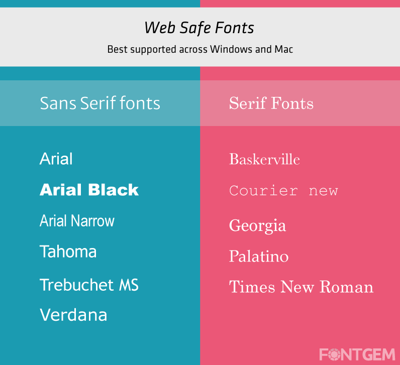
Web-Safe Fonts: Ensuring Consistency Across Devices
In the world of e-commerce, it's essential to ensure that your chosen fonts display consistently across different devices and browsers. This is where web-safe fonts come into play. Web-safe fonts are a selection of typefaces that are universally available on most devices and web browsers. Using these fonts guarantees that your typography will maintain its intended appearance, preventing potential rendering issues for your customers.
Brand Identity: Aligning Typography with Brand Personality
Your brand's typography should be an extension of its identity. Consider the personality and values your brand represents. Are you a fun and quirky brand, a serious and professional one, or something in between? Your typeface should reflect this identity. For example:
-
Playful Brands: Fun and adventurous brands can explore creative and unique fonts that capture the spirit of their products.
-
Professional Brands: Brands aiming for a more corporate or serious image may opt for classic and timeless fonts that exude professionalism.
-
Versatile Brands: Some brands may find a balance between playful and professional by choosing versatile sans-serif fonts with various weights.
We will discuss font size and hierarchy, which are critical for guiding shoppers' attention and conveying essential information effectively.
Font Size and Hierarchy
Typography in e-commerce product descriptions goes beyond selecting the right typeface. Font size and hierarchy are crucial elements that determine how users perceive and interact with your content. We'll explore guidelines for font size and creating a hierarchy in your product descriptions.
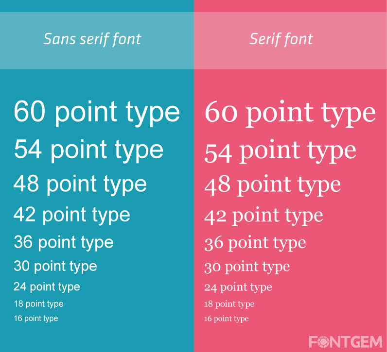
Font Size Guidelines: Legibility and Mobile Responsiveness
One of the primary considerations when setting font size is legibility. Your product descriptions must be easily readable on a wide range of devices, from desktop monitors to smartphones. Here are some guidelines to follow:
-
Body Text Size: For the main product description, aim for a font size between 16 and 18 pixels. This ensures readability without overwhelming the user.
-
Heading Sizes: Use larger font sizes for headings and subheadings to create visual separation and hierarchy. H1 headings should be significantly larger than the body text, while H2 and H3 headings can be progressively smaller.
-
Responsive Font Sizing: Implement responsive font sizing using relative units like "em" or "rem." This allows fonts to adjust proportionally when users zoom in or out or switch between devices.
Creating Hierarchy: Guiding Shoppers' Attention
Hierarchy in typography involves using variations in font size, weight, and style to guide the reader's eye and emphasize key information. Effective hierarchy helps shoppers quickly grasp the most important details about a product. Here's how to establish a hierarchy:
-
Product Titles: Make the product title (H1 heading) the most prominent element on the page. Use a larger font size, bold styling, or a different typeface to set it apart.
-
Subheadings: Use subheadings (H2 and H3 headings) to break up the product description into sections. Ensure they are visually distinct but still harmonious with the overall design.
-
Product Features: Highlight essential product features or benefits by using bold text, italics, or a different font weight. Be consistent in how you emphasize these details.
-
Call to Action: The call to action (e.g., "Add to Cart" or "Buy Now") should stand out prominently. Use a contrasting colour and a larger, bold font to draw attention.
Effective font size and hierarchy work together to make your product descriptions engaging and user-friendly. We will look into the importance of line spacing and line length in typography for e-commerce.
Line Spacing and Line Length
In the world of e-commerce typography, line spacing and line length are often underestimated factors that significantly impact the readability and overall user experience. Let's explore these crucial considerations in more detail.
Line Spacing for Readability: Finding the Ideal Balance
Line spacing, also known as leading, refers to the vertical space between lines of text. Proper line spacing ensures that your product descriptions are easy to read and visually appealing. Here are some guidelines for achieving the ideal line spacing:
-
Avoid Crowding: Insufficient line spacing can lead to cramped text that is difficult to read. Aim for a line spacing of 1.2 to 1.5 times the font size for body text.
-
Enhance Readability: Increased line spacing can enhance readability, especially for longer product descriptions. Experiment with line spacing to find the right balance for your content.
-
Mobile Considerations: Keep in mind that line spacing may need adjustment for mobile devices, as smaller screens may require slightly more spacing for legibility.
Avoiding Overcrowding: Optimal Line Length
Line length, often referred to as line measure, pertains to the horizontal width of text lines. An optimal line length ensures that readers can comfortably follow the text without losing their place. Consider the following tips:
-
Avoid Very Long Lines: Extremely long lines can be overwhelming and tiring to read. Aim for 50 to 75 characters per line for body text. This range provides a comfortable reading experience.
-
Consider Columns: In cases where you have a two-column layout for product descriptions, ensure that each column's line length falls within the recommended range. This prevents excessive eye movement for the reader.
-
Responsive Design: Ensure that line length adjusts responsively on smaller screens. Text that spans the entire width of a mobile device can be challenging to read.
Proper line spacing and line length contribute to the overall legibility and aesthetics of your product descriptions. They work in harmony with font size and hierarchy to create a pleasing reading experience for your customers.
Let's explore the importance of font colour and contrast, including how these elements can influence purchasing decisions.
Font Colour and Contrast
Font colour and contrast are pivotal aspects of typography for e-commerce product descriptions. The choice of colours and the contrast between text and background can significantly impact the visual appeal and readability of your content, ultimately influencing purchasing decisions.
Colour Psychology: Influence of Font Colour on Purchasing Decisions
Colour plays a profound role in shaping human emotions and perceptions. When selecting font colours for your product descriptions, consider the psychological impact you want to achieve:
-
Red: Often associated with urgency and excitement, red can be effective for highlighting limited-time offers or clearance items.
-
Blue: Blue conveys trust and reliability. It's a common choice for product descriptions, especially for brands that aim to build trust with their customers.
-
Green: Green is associated with growth and wellness. It's frequently used for eco-friendly or health-related products.
-
Black: Black is classic and elegant, making it suitable for luxury and high-end products.
-
Contrast with Brand Colors: While considering colour psychology, ensure that your font colours contrast effectively with your brand's primary colours to maintain consistency and readability.
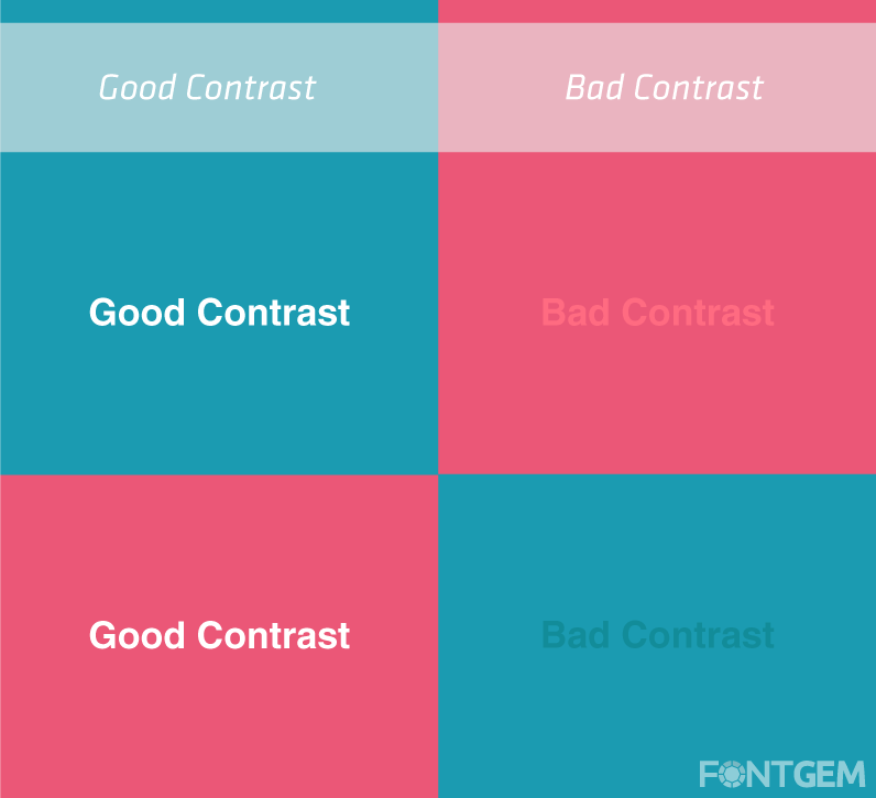
Contrast for Readability: Ensuring Clarity on All Backgrounds
High contrast between text and background is essential for readability. Without adequate contrast, your product descriptions may become difficult to decipher, leading to frustrated visitors. Consider these tips:
-
Dark on Light or Light on Dark: The classic choice is dark text on a light background or vice versa. This provides the highest level of contrast and readability.
-
Avoid Low Contrast: Be cautious with low-contrast combinations like the light grey text on a white background or dark grey on black. These can strain the eyes and deter visitors.
-
Testing for Accessibility: Ensure that your chosen colour combinations meet accessibility standards. There are online tools and guidelines, such as WCAG (Web Content Accessibility Guidelines), that can help you assess and improve accessibility.
-
Hover and Click States: Implement hover and click states with colour changes to provide feedback to users. For instance, a button text colour change when hovered over can indicate interactivity.
By carefully selecting font colours and paying attention to contrast, you can create product descriptions that not only look visually appealing but also enhance the overall user experience. Now let's take a dive into the significance of considering accessibility in typography.
Accessibility Considerations: Making Typography Inclusive
In today's digital age, accessibility is vital across web design facets, including typography. Ensuring e-commerce product descriptions cater to individuals with disabilities not only meets legal obligations but also expands your customer reach. Let's delve into the essential elements of fostering inclusive typography.
Contrast for Visual Impairments
For individuals with visual impairments, high contrast between text and background is essential. Consider the following guidelines:
-
Use Sufficient Contrast: Ensure that the colour contrast ratio between text and background meets accessibility standards, such as those outlined in the WCAG guidelines.
-
Avoid Colour-Only Conveyance: Don't rely solely on colour to convey important information. Use text labels and other visual cues as well.
-
Provide Alt Text: Include descriptive alt text for images, especially those containing text. Screen readers rely on alt text to describe images to users.
Font Size and Readability
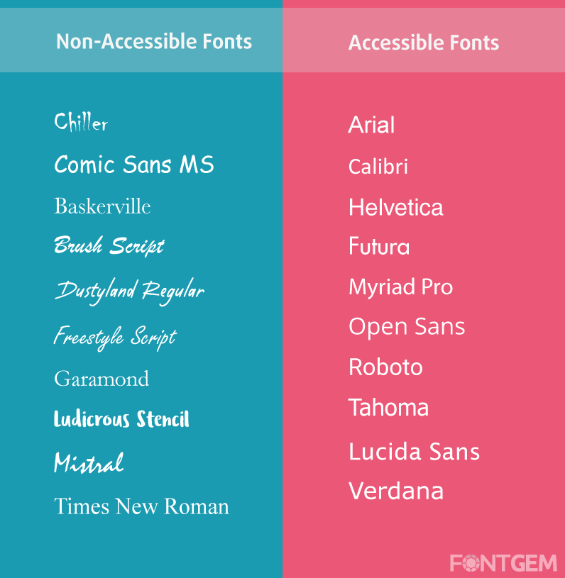
E-commerce sites must accommodate users with varying levels of visual impairment. To enhance readability:
-
Allow Text Resizing: Ensure that users can resize text without it breaking the layout or becoming unreadable.
-
Use Clear Fonts: Opt for legible fonts that are easy to read in different sizes. Avoid overly decorative or complex typefaces.
Keyboard Navigation
Some users rely on keyboards instead of mice for navigation. To accommodate them:
- Ensure Keyboard Accessibility: Ensure that all interactive elements, including buttons and links, can be easily accessed and activated using keyboard navigation.
Screen Reader Compatibility
Screen readers are assistive technologies used by individuals with visual impairments. To make your product descriptions compatible:
-
Semantic Markup: Use semantic HTML elements to structure your content correctly. Screen readers rely on these elements to interpret and present content.
-
Test with Screen Readers: Regularly test your e-commerce site with screen readers to identify and address any issues.
Mobile Accessibility
Mobile devices are common tools for individuals with disabilities. To ensure mobile accessibility:
-
Responsive Design: Implement responsive design practices to accommodate various screen sizes and orientations.
-
Testing Across Devices: Test your site's accessibility on a variety of mobile devices and platforms.
By incorporating accessibility considerations into your typography choices, you not only create a more inclusive shopping experience but also demonstrate a commitment to social responsibility and user satisfaction.
We will reveal the latest typography trends in e-commerce and how they can elevate your online store's design and user experience.
Typography Trends in E-commerce
In the fast-paced world of e-commerce, staying up-to-date with design trends is crucial to maintaining a fresh and appealing online store. Typography is no exception, and here, we'll explore the latest typography trends that can elevate your e-commerce website's design and enhance the user experience.
Responsive Typography: Adapting to Various Screen Sizes
As mobile shopping continues to grow, responsive typography is a top priority for e-commerce designers. Responsive typography ensures that your fonts and text elements adapt seamlessly to different screen sizes and orientations. Key considerations include:
-
Fluid Typography: Implement fluid typography that scales proportionally with the viewport size. This ensures that text remains legible and well-structured on both large desktop monitors and small smartphone screens.
-
Media Queries: Use CSS media queries to adjust font sizes, line spacing, and other typographic elements based on the device's characteristics.
-
Variable Fonts: Explore the use of variable fonts, which offer flexibility in adjusting font-weight, width, and other attributes. Variable fonts can reduce page load times and improve performance.
Variable Fonts: Enhancing Web Performance
Variable fonts are a game-changer in web typography. These fonts allow you to adjust various attributes like weight, width, and slant within a single font file. Here's how variable fonts can benefit your e-commerce site:
-
Improved Performance: Variable fonts reduce the number of font files required to achieve different styles, leading to faster page loading times.
-
Customization: Variable fonts offer more control over typography, allowing you to fine-tune fonts to match your brand's unique identity.
-
Responsive Design: Variable fonts are a natural fit for responsive design, as they can adapt to various screen sizes and resolutions seamlessly.
Custom Typography: Differentiating Your Brand
To stand out in the competitive e-commerce landscape, some brands opt for custom typography. Custom fonts are designed specifically for the brand, creating a unique and memorable visual identity. Here's how custom typography can set your e-commerce store apart:
-
Brand Recognition: Custom fonts reinforce brand recognition and help establish a strong visual identity.
-
Uniqueness: Custom fonts ensure that your typography is distinct and cannot be easily replicated by competitors.
-
Consistency: Custom fonts allow for precise control over typography, ensuring that it remains consistent across all marketing materials.
Embracing these typography trends can give your e-commerce website a fresh and contemporary look, making it more appealing to modern shoppers. Let us now unveil essential typography tools for e-commerce that can simplify the process of font selection and implementation.
Typography Tools for E-commerce
Selecting and implementing typography for your e-commerce site can be a complex task. Fortunately, there are numerous tools and resources available to simplify the process and ensure that your typography choices align with your brand and design goals. Now we will explore some essential typography tools for e-commerce.
Google Fonts: A Vast Library for Web Typography
Google Fonts is a treasure trove of web-friendly typefaces that can be easily integrated into your e-commerce website. Here's why it's a valuable resource:
-
Extensive Collection: Google Fonts offers a vast and diverse collection of typefaces, from classic serif fonts to contemporary sans-serif options.
-
Web-Friendly: All Google Fonts are optimized for web use, ensuring fast loading times and compatibility across browsers.
-
Easy Integration: Google Fonts provides straightforward integration options, including embedding fonts via CSS or using Google's APIs.
Adobe Typekit: Premium Fonts for Professional E-commerce Sites
For e-commerce brands looking for premium and exclusive typography options, Adobe Typekit is a top choice. Here's why it's worth considering:
-
High-Quality Fonts: Adobe Typekit offers a curated selection of high-quality and professionally designed fonts that can elevate your brand's image.
-
Licensing Control: You can easily manage font licenses and ensure compliance with copyright and licensing requirements.
-
Web and Desktop Use: Adobe Typekit provides options for both web and desktop use, allowing for consistent branding across various touchpoints.
Font Pairing Tools: Ensuring Harmonious Combinations
Choosing complementary fonts for headings, body text, and other elements is essential for a harmonious design. Font pairing tools can help you find combinations that work well together.
Mobile-Friendly Typography
In the mobile shopping era, optimizing typography for mobile devices is crucial.
Scaling for Mobile Devices: Responsive Typography Techniques
Ensuring that your typography scales effectively on mobile devices is critical for a seamless user experience. Here are key techniques to achieve responsive typography:
-
Viewport Units: Use viewport units (vw and vh) for font size and spacing. These units are relative to the viewport size and automatically adjust text to fit the screen.
-
Media Queries: Implement CSS media queries to set specific font sizes and styles for different screen sizes and orientations.
-
Fluid Typography: Employ fluid typography techniques to create flexible and proportional font scaling as the screen size changes.
Touch-Friendly Design: Improving the Mobile Shopping Experience
Mobile users interact with e-commerce sites primarily through touch gestures. Optimizing typography for touch-friendly design can enhance the mobile shopping experience:
-
Adequate Touch Target Size: Ensure that buttons, links, and interactive elements have a sufficiently large touch target to prevent accidental taps and frustration.
-
Ample Spacing: Add spacing between interactive elements to reduce the risk of users tapping the wrong item, especially on smaller screens.
-
Readable Text: Prioritize legibility by maintaining adequate font size and contrast to accommodate touch interaction.
Navigation and Scrolling: Considerations for Mobile
Incorporate typography considerations into your mobile navigation and scrolling patterns:
-
Navigation Labels: Use clear and concise typography for navigation labels. Iconography can also aid mobile users in understanding navigation.
-
Scrolling Behavior: Implement smooth scrolling with subtle animations and transitions for a more engaging and user-friendly experience.
-
Condense Information: On mobile devices, space is limited. Condense information in a way that retains clarity while minimizing scrolling and taps.
By implementing these mobile-friendly typography practices, you'll cater to the growing number of mobile shoppers and enhance their experience on your e-commerce site.
We will now go into the importance of A/B testing typography in e-commerce to optimize your design for maximum impact.
A/B Testing Typography
To optimize e-commerce product descriptions, ongoing refinement and A/B testing of typography are crucial. We will discuss the importance and effective application of A/B testing for font choices, styles, and layouts.
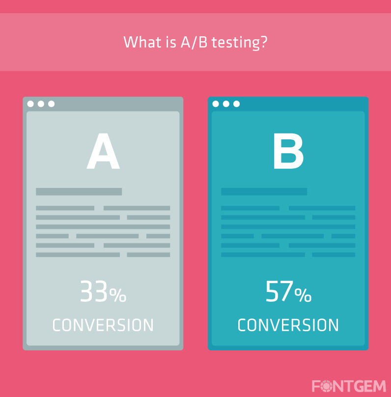
The Importance of Testing
A/B testing, also known as split testing, involves comparing two versions of a webpage to determine which one performs better in terms of user engagement and conversions. When it comes to typography, A/B testing can help you:
-
Identify High-Performing Fonts: Discover which typefaces are most effective at capturing user attention and conveying your message.
-
Optimize Readability: Test different font sizes, line spacing, and contrast ratios to find the optimal combinations for your audience.
-
Refine Hierarchy: Experiment with different heading styles and arrangements to determine the hierarchy that leads to higher conversions.
Measuring Impact
To conduct A/B tests on typography effectively, you'll need to establish clear key performance indicators (KPIs) and metrics to measure impact. Consider these metrics:
-
Conversion Rate: Measure the percentage of visitors who take the desired action, such as making a purchase or signing up for a newsletter.
-
Bounce Rate: Analyze how typography affects bounce rates—higher bounce rates indicate that visitors are leaving the site quickly.
-
Time on Page: Evaluate whether typography changes impact how long users stay on product description pages.
-
Click-Through Rate (CTR): Assess how typography influences the click-through rate on product images, buttons, and links.
Iterative Refinement
A/B testing is an iterative process. It's essential to make incremental changes and continuously monitor the impact of those changes on user behaviour. Here's a suggested workflow:
-
Hypothesis: Formulate a hypothesis about how a typography change will impact user behaviour. For example, changing the font size of product titles may increase click-through rates.
-
A/B Test Setup: Create two versions of the webpage: one with the current typography (the control) and one with the proposed typography change (the variant).
-
Random Assignment: Randomly assign users to either the control or variant group when they visit the page.
-
Data Collection: Collect data on user interactions, such as clicks, conversions, and time spent on the page, for both groups.
-
Analysis: Analyze the data to determine if there is a statistically significant difference between the two groups. Tools like Google Optimize or Optimizely can help with this analysis.
-
Implementation: If the variant outperforms the control, implement the typography change site-wide. If not, iterate and test other variations.
-
Continuous Testing: Continue to test and refine typography and other design elements to optimize user experience and conversions.
A/B testing typography is data-driven for e-commerce site improvement. Testing and refining typography choices inform decisions that enhance user engagement and conversion rates.
Optimizing for SEO
In e-commerce, optimizing product descriptions for search engines is vital for organic traffic and search result visibility. Typography impacts both readability and SEO rankings. Read on as we delve into optimizing typography for SEO.
Keyword Placement
Effective keyword placement within your product descriptions can significantly impact your SEO efforts. Here are some guidelines for strategically incorporating keywords:
-
Product Titles: Include relevant keywords in product titles. This helps search engines understand the content of the page and improves your chances of ranking for those keywords.
-
Headings and Subheadings: Use keywords naturally in headings and subheadings to provide context and structure to your product descriptions.
-
Product Descriptions: Integrate keywords naturally within the body of your product descriptions. Avoid keyword stuffing, which can negatively impact both user experience and SEO.
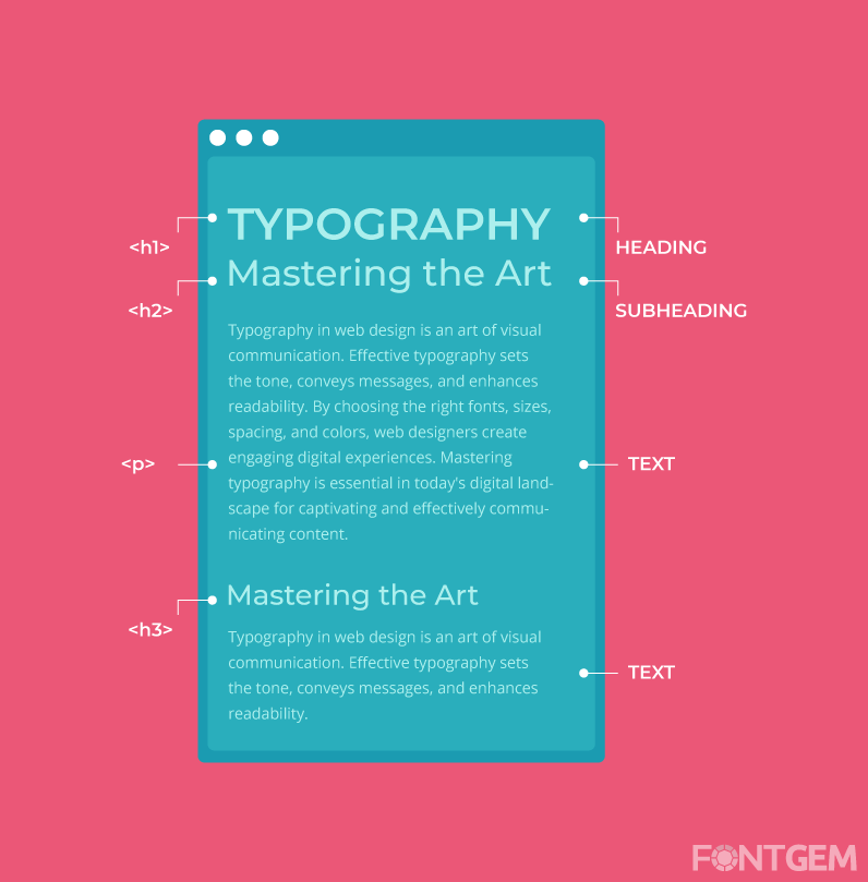
Heading Tags
Properly structured headings using HTML heading tags (H1, H2, H3, etc.) can improve both user experience and SEO. Here's how to use them effectively:
-
H1 Tag: Reserve the H1 tag for the product title. It should be the primary heading on the page and include your primary keyword.
-
H2 and H3 Tags: Use H2 and H3 tags for subheadings within your product descriptions. These tags provide hierarchy and help search engines understand the content's structure.
-
Keyword Variations: Include keyword variations in subheadings, when appropriate, to capture a broader range of search queries.
Alt Text for Images
Images are an essential part of e-commerce product descriptions. To ensure that search engines can understand the content of your images:
-
Alt Text: Include descriptive alt text for product images. Alt text provides a textual description of the image and is valuable for SEO and accessibility.
-
Keyword Relevance: Incorporate relevant keywords in alt text while maintaining accuracy and relevance to the image content.
-
Accessibility: Alt text not only benefits SEO but also ensures that visually impaired users can understand the images through screen readers.
Optimizing typography for SEO involves a delicate balance between making your content search engine-friendly and maintaining a positive user experience. Ensure that keywords are seamlessly integrated into your product descriptions without compromising readability.
Typography in web design evolves with technology and trends. Be ready to adjust your choices. Your e-commerce product description typography can powerfully convey your brand's message and enhance customer engagement and conversions. Attention to typography creates an exceptional shopping experience.
LEAVE A COMMENT
Categories
Recent Posts


0.0602