How to Use Typography to Create a Mood or Tone
Typography is not merely a matter of selecting fonts and arranging text; it is a powerful tool that can evoke emotions, establish a tone, and influence how your audience perceives your message. Whether you're designing a website, creating marketing materials, or crafting a blog post, understanding how to use typography to create a mood or tone can significantly impact the effectiveness of your communication.
We will take a look at the art of typographic mood-setting and provide practical tips to help you effectively use typography to convey emotions and set the desired tone.
1. Choose Appropriate Fonts
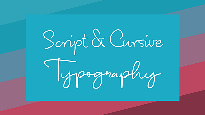
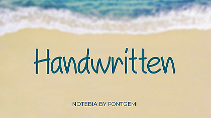
Fonts play a crucial role in setting the mood of your content. Different fonts possess distinct personalities and characteristics. For instance, serif fonts often convey tradition, elegance, and formality, making them suitable for creating a serious or classic tone. On the other hand, sans-serif fonts are clean, modern, and straightforward, making them ideal for a more casual and friendly mood. Script fonts can introduce a sense of elegance or creativity, while display fonts can add excitement and a sense of fun.
2. Consider Font Styles
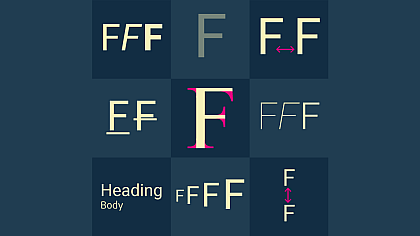
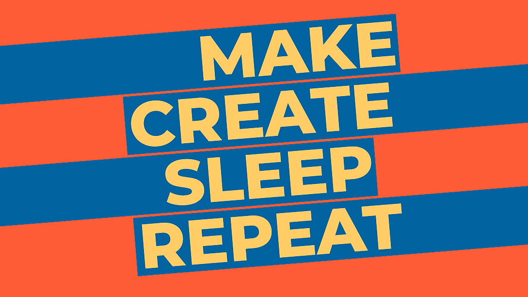
Font styles, such as bold, italic, and underline, can add emphasis and nuance to your text. Bold fonts command attention and create a strong and assertive tone, suitable for headlines or statements you want to emphasize. Italics can introduce a sense of elegance or emphasis on certain words or phrases. Underlining can be used sparingly for highlighting specific information. Understanding when and how to apply different font styles can help you create the desired mood effectively.
3. Pay Attention to Font Size
Font size can significantly influence the mood of your content. Larger fonts are often associated with boldness and excitement, making them suitable for headlines and attention-grabbing statements. Smaller fonts, on the other hand, create a more intimate and reserved atmosphere, which can work well for conveying a sense of calmness or introspection. Finding the right balance between font sizes can help you effectively set the tone for different sections of your content.
4. Utilize Colour Wisely
Colour is an essential element in typography that can enhance the mood of your text. Warm colours like red and orange can evoke passion, energy, and urgency, making them ideal for grabbing attention or creating a sense of excitement. On the other hand, cool colours like blue and green can create a sense of calmness, tranquillity, and reliability, suitable for conveying trustworthiness or a soothing atmosphere. Use colour sparingly and consistently to align with the overall tone you want to convey, but avoid excessive use, as it can lead to visual clutter and distract from your message.
5. Pay Attention to Line Spacing and Alignment
The way your text is spaced and aligned can impact readability and the overall feel of your content. Wider line spacing can create an open and breathable atmosphere, which works well for conveying a sense of relaxation or sophistication. Tighter spacing can add a sense of density and urgency, suitable for a more energetic or dynamic tone. Additionally, the choice of alignment can influence the mood; justified alignment can give a formal and organized impression, while the left-aligned text is often perceived as more casual and approachable.
6. Pair Fonts Thoughtfully
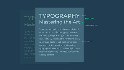
Combining multiple fonts can create visual interest and depth in your design, but it requires careful consideration. Fonts that complement each other can reinforce the desired mood while clashing fonts can create confusion and disrupt the tone you want to convey. Stick to a harmonious font pairing that aligns with your intended emotional impact. A combination of a display font for headlines and a more legible font for body text often works well.
7. Test and Iterate
Typography is a creative process, and finding the perfect mood-setting combination may require experimentation. Test different typographic elements and gather feedback from others to see how they perceive the mood you are trying to convey. Iterate on your design until you achieve the desired emotional impact. Remember that typography is not a one-size-fits-all solution; the tone you want to create may vary depending on your content and target audience.
Typography is a versatile and influential tool that can evoke emotions, set the tone, and leave a lasting impression on your audience. By carefully selecting fonts, styles, sizes, colours, and alignments, you can effectively use typography to create the desired mood and enhance the overall impact of your message.
A thoughtful approach to typography allows you to strengthen the connection between your content and your readers, ultimately improving the effectiveness of your communication.

