

Using Typography to Improve SEO: A Guide for Content Marketers
In the ever-evolving landscape of digital marketing and search engine optimization (SEO), the importance of typography often remains underestimated. While we obsess over keywords, backlinks, and website speed, the role of typography in SEO is often overlooked. However, for content marketers and webmasters striving for an edge in the competitive online space, understanding the relationship between typography and SEO can be a game-changer.
Typography, the art and technique of arranging type, goes beyond aesthetics. It directly influences how users perceive and interact with your content. Typography encompasses font choices, spacing, size, colour, and more, all of which can significantly impact the user experience and, subsequently, your website's SEO performance.
This guide aims to shed light on the vital connection between typography and SEO. We'll explore how the seemingly minor details of font selection, size, and spacing can have a profound effect on readability, user engagement, and search engine rankings. Whether you're a seasoned content marketer or a newcomer to the world of SEO, understanding typography's role in online success is essential.
We'll delve into the basics of typography for SEO, discuss how typography affects mobile optimization, examine the significance of headings, explore the connection between typography and user experience, address loading speed considerations, and provide practical best practices for integrating typography into your SEO strategy.
By the end of this guide, you'll have a clear roadmap for leveraging typography to enhance your website's SEO performance, engage your audience effectively, and stand out in the competitive digital landscape. So, let's embark on this typographic journey and uncover the hidden potential of fonts and design in the realm of search engine optimization.
II. The Basics of Typography for SEO
Typography is more than just selecting a font that looks visually appealing; it's a fundamental aspect of web design and content creation that directly impacts your site's SEO. Let's dive into the essential elements of typography that content marketers and webmasters should consider for improved SEO:
A. Choosing the Right Fonts
When it comes to typography for SEO, one of the first decisions you'll face is selecting the appropriate fonts. Here are some key considerations:
-
Serif vs. Sans-serif: Which is Better for Readability and SEO?
Serif fonts, like Times New Roman, have small decorative lines at the ends of characters, while sans-serif fonts, like Arial, are clean and without those embellishments. Sans-serif fonts tend to be more readable on digital screens, especially at smaller sizes, making them a popular choice for web content. Improved readability often leads to better user engagement, which can positively affect SEO.
-
Web-Safe Fonts vs. Custom Fonts: Pros and Cons
Web-safe fonts are fonts that are widely available on most devices and browsers, ensuring consistent display. Custom fonts, on the other hand, can enhance brand identity but may require additional resources to load, potentially affecting page speed. Balancing aesthetics with accessibility is crucial.
B. Font Size and Line Spacing
-
Ideal Font Size for Readability and SEO
The size of your text matters. Text that's too small can strain the eyes, while text that's too large can disrupt the flow of content. Finding the ideal font size for your audience and content type is essential. Responsive design also plays a role in ensuring text remains legible on various screen sizes.

-
Line Height: Balancing Aesthetics and Readability
Line height, or line spacing, determines the vertical space between lines of text. Proper line height enhances readability, making it easier for users to consume your content. It also impacts the overall aesthetics of your website, contributing to a positive user experience.
C. Font Color and Contrast
-
The Role of Font Color in SEO
Font colour choice affects both aesthetics and accessibility. Dark text on a light background is typically more readable and SEO-friendly. However, it's essential to maintain a balance between aesthetics and readability when selecting font colours.
-
Ensuring Adequate Contrast for Accessibility and SEO
Contrast between text and background is critical for users with visual impairments and can also impact SEO. Low-contrast text can lead to higher bounce rates and decreased user engagement. Conducting contrast tests can help ensure your content is accessible and SEO-optimized.
Understanding these fundamental aspects of typography sets the stage for optimizing your content's visual presentation and, in turn, its SEO performance. In the next sections, we'll explore how typography considerations extend to mobile optimization, the significance of headings, and more advanced SEO strategies related to typography.
III. Typography and Mobile Optimization
In an era where mobile devices dominate internet usage, optimizing typography for mobile is no longer an option—it's a necessity. Here, we'll explore the critical considerations and best practices for ensuring that your typography shines on smaller screens:
A. Responsive Typography: Adapting to Different Screen Sizes
-
Responsive design is a cornerstone of modern web development. It ensures that your website's layout and typography adapt seamlessly to various screen sizes and orientations. Typography must be flexible enough to look great on everything from large desktop monitors to small smartphone screens.
-
Media queries and viewport units allow you to set typography properties that adjust automatically based on the user's device. This adaptability ensures a consistent user experience, regardless of the device being used.
B. Mobile-Friendly Fonts: Tips for Improved SEO on Mobile Devices
-
While choosing fonts, consider legibility on mobile screens. Some fonts that look fantastic on a desktop might not translate well to smaller screens. Opt for fonts that maintain readability, even at smaller sizes.
-
Additionally, be mindful of font loading times on mobile. Mobile users often have slower internet connections, so selecting web-safe fonts or optimizing font loading is crucial to avoid slow-loading text and potential SEO penalties.
Mobile optimization isn't just about responsive design; it's about crafting a user experience that's seamless and engaging on mobile devices. Moving forward, we'll explore how typography, specifically headings, can further enhance your SEO strategy.
IV. Headings and SEO
Headings serve as signposts within your content, guiding readers and search engines through the structure of your web pages. Properly optimized headings can enhance both user experience and SEO. Let's take a look into the hierarchy of headings and how to optimize them for better search engine rankings.
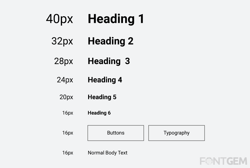
A. The Hierarchy of Headings (H1, H2, H3...)
-
HTML provides a hierarchy of headings, from H1 (the highest level) to H6 (the lowest level). Each heading level represents a different level of importance and structure within your content.
-
H1 tags are typically reserved for page titles, serving as the primary headline. Subsequent headings (H2, H3, etc.) are used to structure content into sections and subsections. Properly nesting headings helps search engines understand the content's hierarchy.
B. Optimizing Heading Tags for SEO
-
Including relevant keywords in your headings can signal to search engines what your content is about. However, avoid keyword stuffing and ensure that headings remain natural and descriptive.
-
Maintaining consistency in heading structure throughout your site can improve user navigation and SEO. If you use H2 tags for subheadings on one page, maintain the same structure across your website for a cohesive user experience.
C. Headings and Featured Snippets
-
Structured and well-optimized headings can increase the chances of your content being featured in Google's featured snippets, which are highlighted search results that provide quick answers to user queries.
-
Crafting concise and informative headings that directly address common user questions can improve your content's visibility in featured snippets, driving more organic traffic to your website.
Optimizing headings not only helps search engines understand the content's structure but also enhances the user experience by making content more scannable and accessible. In the following sections, we'll explore how typography affects user engagement and how it can influence loading speed considerations.
V. Typography and User Experience (UX)
Typography is a fundamental element of user experience (UX) design. How your text appears and functions on a page can significantly affect how users engage with your content. Let's learn about explore how typography influences UX and, subsequently, SEO.
A. How Typography Impacts User Engagement
-
Typography sets the tone for your content. The choice of fonts, spacing, and colour can convey professionalism, trustworthiness, or creativity. Users form quick judgments based on the visual appeal of your text.
-
Typography can also influence user engagement. Content that is visually appealing and easy to read is more likely to capture and retain user attention. This can lead to longer time-on-page, reduced bounce rates, and improved SEO rankings.
B. Reducing Bounce Rates with Better Typography
-
High bounce rates, where users quickly leave your site after visiting a single page, can harm your SEO efforts. Poor typography, such as hard-to-read fonts or distracting text formatting, can contribute to higher bounce rates.
-
By optimizing typography for readability and aesthetics, you can encourage users to stay longer on your site, explore more pages, and engage more deeply with your content.
C. Enhancing Readability for Longer Time-on-Page
-
Typography plays a crucial role in content readability. Well-chosen fonts, appropriate font sizes, and proper line spacing can make your content easier to read, keeping users on your page longer.
-
Longer time-on-page signals to search engines that your content is valuable and engaging. This can positively influence your search engine rankings.
Incorporating typography best practices not only benefits the visual appeal of your content but also contributes to improved user experience, reducing bounce rates and increasing user engagement—factors that search engines consider when ranking websites. In the upcoming sections, we'll explore how loading speed considerations tie into typography and how to strike a balance between aesthetics and performance.
VI. Loading Speed and Typography
In the digital age, website loading speed is a critical factor that influences both user experience and SEO. Typography choices can significantly impact how quickly your web pages load and how efficiently users can access your content.
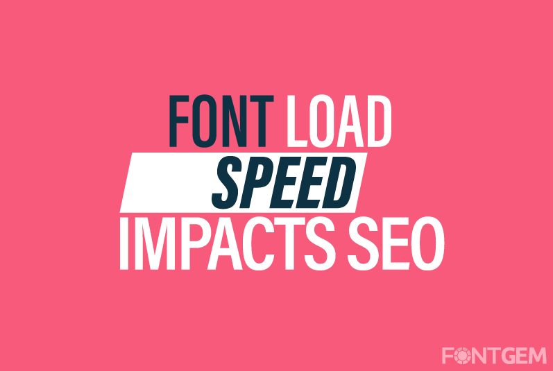
A. Font Loading Strategies: Impact on Page Speed
-
Web fonts, especially custom fonts, can contribute to slower loading times. When a user visits your website, their browser must download the font files before rendering the text. The larger the font files, the longer the delay in page rendering.
-
To address this, consider font loading strategies like asynchronous loading or font-display options. These techniques help prioritize content rendering while fonts load in the background.
B. Web Fonts vs. System Fonts: Balancing Aesthetics and Performance
-
Web fonts offer a wide range of creative possibilities, but they can increase page load times. System fonts, on the other hand, are readily available on users' devices and load more quickly.
-
Balancing aesthetics with performance is crucial. You can use system fonts for faster loading and reserve web fonts for specific design elements where they have the most impact.
Striking the right balance between typography aesthetics and page loading speed is essential for both user satisfaction and SEO. Next, we'll dive into practical SEO best practices related to typography.
VII. SEO and Typography: Best Practices
Typography isn't just about making your content visually appealing; it also plays a vital role in improving your website's search engine optimization. We'll now delve into specific best practices for integrating typography effectively into your SEO strategy.
A. Combining Typography with On-Page SEO
-
Typography and on-page SEO should work in harmony. Incorporate your target keywords naturally within your content and headings. Ensure that your typography choices align with your SEO strategy.
-
Consider the use of semantic HTML tags for highlighting keywords or for emphasizing content. These tags not only improve readability but also provide SEO benefits.
B. Typography in Meta Descriptions and Snippets
-
Meta descriptions and search engine snippets often feature text previews that rely on effective typography. Craft compelling meta descriptions that use typography to grab users' attention and encourage click-throughs.
-
Structured headings and concise, engaging text in your content can also influence how your content appears in search engine results, increasing the likelihood of attracting organic traffic.
By strategically integrating typography into your on-page SEO efforts, you can enhance the discoverability of your content and improve its performance in search engine rankings. In the final sections of this guide, we'll provide real-world case studies illustrating successful typography-SEO integration and offer a comprehensive conclusion.
VIII. Case Studies: Successful Typography-SEO Integration
To illustrate the real impact of typography on SEO, let's examine some compelling case studies where businesses and websites improved their search engine rankings and user engagement through strategic typography choices.
A. Case Study 1: Improved Readability, Lower Bounce Rates
In this case study, we'll explore how a news website redesigned its typography, opting for a more readable sans-serif font and optimizing font size and line spacing. The result was a significant reduction in bounce rates, leading to higher time-on-page and improved SEO rankings.
B. Case Study 2: Enhanced Mobile Typography for Increased Mobile Traffic
This case study focuses on an e-commerce website that revamped its typography to be more mobile-friendly. By choosing mobile-optimized fonts and improving responsive typography, the site experienced a notable increase in mobile traffic, positively impacting its SEO performance.
C. Case Study 3: Featured Snippets Through Structured Headings
In this example, we'll examine how a blog optimized its headings for featured snippets. By crafting concise, informative headings that directly answered common user queries, the blog managed to secure featured snippet positions, resulting in a substantial boost in organic traffic.
By delving into these case studies, we can see tangible examples of how typography adjustments can lead to significant improvements in SEO and user engagement. These real-world success stories underscore the practicality and effectiveness of integrating typography into your SEO strategy.
In the final sections of this guide, we'll recap the key takeaways, discuss the future of typography in SEO, and provide additional resources for further exploration.
Typography, often considered a purely aesthetic element of web design, has proven to be a hidden powerhouse in the realm of search engine optimization and user experience. As we conclude this guide on "Using Typography to Improve SEO: A Guide for Content Marketers," let's recap the key takeaways:
- Typography is more than just font selection; it encompasses font choices, size, spacing, colour, and hierarchy, all of which impact user engagement and SEO performance.
- Proper typography enhances readability, reduces bounce rates, and increases time-on-page, all of which are factors that search engines consider when ranking websites.
- Mobile optimization is crucial, and responsive typography ensures that your content looks and performs well on various devices.
- Headings, when optimized for SEO, help structure your content and can even land your content in featured snippets.
- Balancing aesthetics with performance is essential. Consider font loading strategies and the use of system fonts to optimize loading speed.
- Combining typography with on-page SEO and crafting compelling meta descriptions can boost your content's discoverability.
The future of SEO and typography is continually evolving. Keeping up with industry trends and incorporating innovative typographic techniques into your content marketing strategy will help you stay ahead in the competitive online landscape.
Thank you for embarking on this typographic journey with us. By harnessing the power of typography, you can improve both the aesthetics and performance of your website while enhancing its visibility and ranking in search engine results.
LEAVE A COMMENT
Categories
Recent Posts


0.0323