The Power of Colour in Typography: How to Use Colour to Enhance Your Message
When it comes to typography, choosing the right colours is just as important as selecting the right font and spacing. Colour can help convey the message and emotions of your text, and it can also play a crucial role in making your typography legible and visually appealing.
Let's delve deeper into the power of colour in typography, including the psychology of colour and best practices for choosing and using colour.
The Psychology of Colour in Typography
Understanding the psychology of color in typography is paramount, as colors possess the remarkable ability to influence human psychology and emotions. Consider red, which often evokes feelings of passion and intensity, or the calming and trust-inducing qualities associated with blue. These emotional associations hold immense significance when selecting colors for your typography, particularly in tailoring your message to resonate with your audience.
Color psychology, a field dedicated to exploring how colors impact human behavior and emotions, is indispensable in shaping an effective color palette for your typography. Each color carries distinct emotional connotations that can profoundly affect how your message is received. For instance:
- Red embodies passion, energy, and urgency.
- Orange radiates enthusiasm, warmth, and excitement.
- Yellow exudes optimism, clarity, and creativity.
- Green symbolizes growth, harmony, and health.
- Blue signifies trust, stability, and peace.
- Purple conveys notions of luxury, mystery, and creativity.
- Black emanates elegance, sophistication, and authority.
- White evokes purity, simplicity, and clarity.
When crafting a color palette for your typography, it's essential to align your color choices with the emotions and messages you aim to convey. For instance, if you're designing a poster for a lively music festival, opting for a vibrant palette with energetic oranges and yellows can capture the event's spirit. Conversely, if you're developing a website for a law firm, selecting a more subdued palette characterized by calming blues and trust-inducing greys can establish professionalism and reliability.
Choosing the Right Colour Palette
Once you have an idea of the emotions and messages you want to convey, it's time to choose a colour palette for your typography. There are a few things to consider when choosing a colour palette:
Context and audience: Consider the context and the audience when selecting colours. For example, if you're designing a website for a children's toy store, you might choose bright, playful colours that appeal to children.
Complementary and analogous colours: Use a colour wheel to select complementary or analogous colours. Complementary colours are colours that are opposite each other on the colour wheel, such as blue and orange. Analogous colours are colours that are next to each other on the colour wheel, such as blue and green.
Contrast: Use high-contrast colours for maximum legibility. For example, white text on a black background provides maximum contrast, making the text easy to read.
Highlighting important information: Use colour to draw attention to important information or call to action. For example, you might use a bright red colour for a "Buy Now" button to make it stand out from the rest of the page.
Using colour sparingly: Use colour sparingly to avoid overwhelming the viewer. Too many colours can be distracting and make it difficult to focus on the content.
Using Colour in Typography
Once you've chosen a colour palette, it's time to apply it to your typography. Here are some tips for using colour in typography:
Setting the tone and mood: Use colour to set the tone and mood of your message. For example, a blue colour palette might be calming and relaxing, while a red colour palette might be energizing and passionate.
Drawing attention to important information: Use colour to draw attention to important information. For example, you might use a bright yellow colour for a heading to make it stand out from the rest of the text.
Creating hierarchy and structure: Use colour to create hierarchy and structure in your typography. For example, you might use a bold, dark blue colour for headings, and a lighter blue colour for subheadings.
Creating contrast: Use colour to create contrast for maximum legibility. For example, you might use a dark colour for text on a light background, and a light colour for text on a dark background
Choosing a Colour Scheme for Your Typography
When it comes to choosing a colour scheme for your typography, there are a few things to consider.
First, you want to think about the mood or emotion you want to convey with your content. For example, if you're creating a blog post about a relaxing vacation, you might want to choose calming colours like blues and greens.
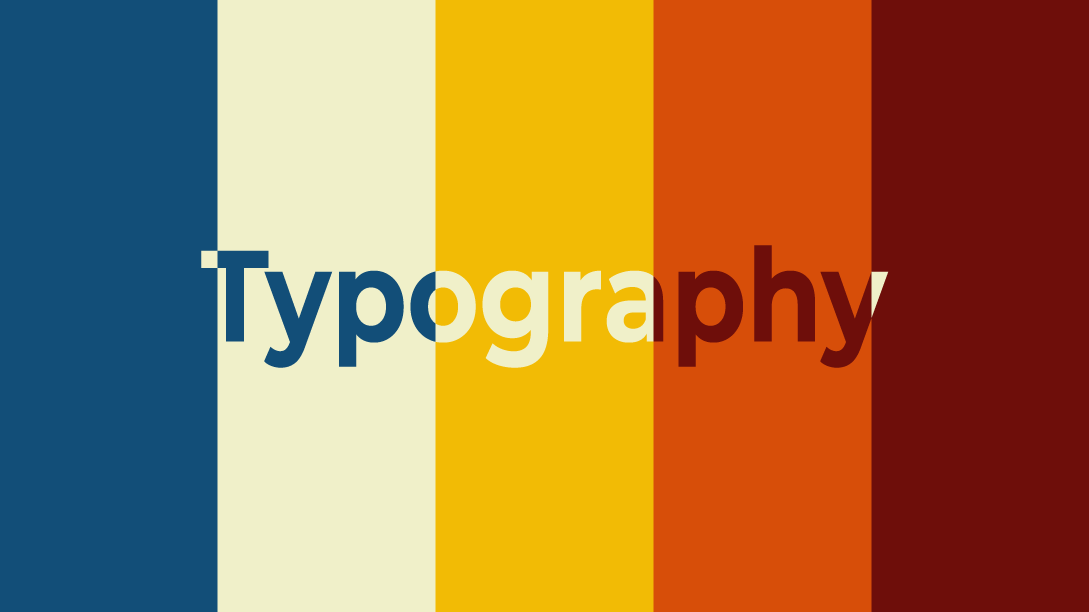
Second, you want to make sure that the colours you choose complement each other and don't clash. One way to do this is by using a colour wheel, which can help you choose colours that are complementary, triadic, or analogous.
Using Colour Contrast to Enhance Readability
Colour contrast is an important consideration in typography, especially when it comes to readability. You want to make sure that your text is easy to read, regardless of the background colour or image.
One way to ensure good colour contrast is to use the Web Content Accessibility Guidelines (WCAG) as a reference. The guidelines provide specific colour contrast ratios that are considered acceptable for different types of content.
Examples of Effective Colour Typography
Looking at examples of effective colour typography can help you understand how different colour schemes and combinations can be used to create different moods and convey different emotions. Some examples of effective colour typography include:
• Spotify's use of bright, bold colours to convey energy and excitement
• Apple's use of simple, minimalist designs with monochromatic colour schemes to convey sophistication and elegance
• Coca-Cola's use of red and white to create a bold, iconic brand image
Colour is a powerful tool in typography, evoking emotions, and influencing behaviour. Typography is an important aspect of design, and colour plays a significant role in its effectiveness.
By understanding the psychology of colour and choosing the right colour palette, you can create typography that enhances your message and engages your audience. Use colour sparingly, and consistently to create a cohesive design, and always consider accessibility when selecting colours. With these tips and best practices, you can use the power of colour to take your typography to the next level.

