

The Power of Typography in Blogging: How to Make Your Content Stand Out
As a blogger, you know that creating engaging content is key to building a following and growing your online presence. But did you know that typography plays a crucial role in how readers perceive your message?
The right choice of fonts, sizes, and styles can make your content more readable, memorable, and impactful.
We will explore the power of typography in blogging and provide you with practical advice on how to use it to your advantage.
Why Typography Matters in Blogging
Typography refers to the art and technique of arranging type to make written language legible, readable, and appealing when displayed. In other words, typography is the way you present your words on the screen, and it can make a significant difference in how readers perceive your message.
The typography choices you make can affect how people feel about your blog, the readability of your content, and even your brand's image. For example, a blog that uses a hard-to-read font or inconsistent typography can make readers feel frustrated or give the impression that the author is unprofessional or careless.
On the other hand, a blog that uses a clean, easy-to-read font and consistent typography can create a positive first impression, make readers feel more engaged, and help establish a recognizable brand image.
The Science of Typography: What Research Says
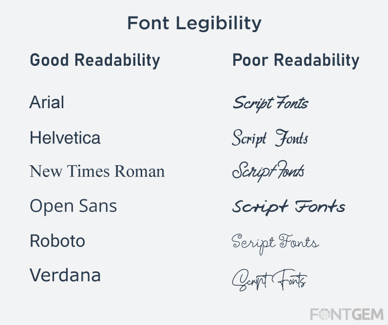
Typography is not just a matter of aesthetics, but it also has a scientific basis. Numerous studies have explored how typography affects reading speed, comprehension, and recall. For example, a study by the Software Usability Research Laboratory at Wichita State University found that readers were able to read a simple font faster and with fewer errors than a more complex one.
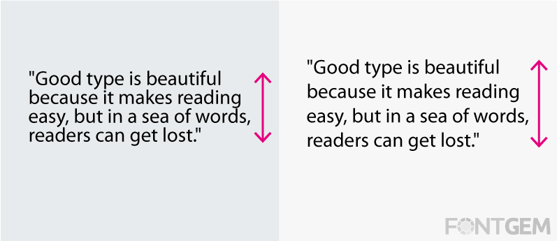
Another study by the same laboratory showed that using larger font sizes can improve reading speed, as long as the font does not become too wide or too tall. Other research has found that using a sans-serif font can improve readability on screens while using a serif font can improve print readability.
Understanding these scientific findings can help bloggers make more informed typography choices that can improve their content's effectiveness.
Choosing the Right Fonts for Your Blog
One of the most critical typography decisions bloggers must make is choosing the right font(s) for their blog. There are countless options out there, from classic fonts like Times New Roman to more modern ones like Open Sans or Montserrat.
When choosing fonts for your blog, it's essential to consider several factors, such as the audience, the blog's purpose, and the blog's style. For example, a blog about fashion might benefit from a script or handwriting-style font, while a technical blog might be better suited to a clean, sans-serif font.
It's also important to consider legibility and readability when choosing fonts. Some fonts might look great in large sizes or on a header but can be challenging to read in smaller sizes or in body text. Additionally, some fonts might be too fancy or decorative, making them harder to read.
To choose the right fonts for your blog, you can use online resources like Google Fonts or Adobe Fonts, which offer a vast selection of free and paid fonts. You can also try experimenting with different fonts and combinations until you find the ones that work best for your content and style.
How to Use Typography to Enhance Your Message
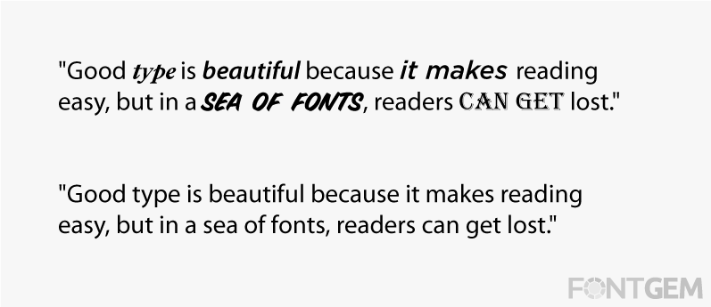
Typography can do much more than make your content look good – it can also help you convey your message more effectively. By using typography strategically, you can emphasize key points, create a visual hierarchy, and make your content more engaging.
For example, you can use bold or italicized text to draw attention to important words or phrases, such as key points or calls to action. You can also use different font sizes or styles to create a visual hierarchy, making it clear which information is more important or should be read first.
Another way to use typography to enhance your message is to play with the placement and spacing of your text. For example, you can use line breaks, bullet points, or numbered lists to break up dense text and make it more readable. You can also experiment with spacing between letters, words, or lines to create a more balanced or dynamic layout.
Finally, you can use typography to create a unique and recognizable brand image. By choosing a consistent font or typography style for your blog, you can create a visual identity that helps readers recognize your content and associate it with your brand.
Tips for Creating a Consistent Typography Style
Consistency is key when it comes to typography. Using a consistent font, size, and style throughout your blog can help create a professional, cohesive look and feel. Here are some tips for creating a consistent typography style:
• Choose a font or typography style that reflects your blog's tone and purpose.
• Limit your font choices to two or three complementary fonts.
• Use the same font for headlines, subheadings, and body text.
• Use consistent font sizes and spacing throughout your blog.
• Use the same colour scheme for your typography throughout your blog.
• Consider creating a style guide that outlines your typography choices and guidelines.
By creating a consistent typography style for your blog, you can help establish your brand image and make your content more recognizable and memorable.
Best Practices for Typography on Mobile Devices
With more and more readers accessing blogs on their mobile devices, it's essential to consider how typography choices affect mobile readability. Here are some best practices for typography on mobile devices:
• Choose a font that is legible on small screens.
• Use font sizes that are large enough to read on mobile screens.
• Consider using a condensed font to save space on small screens.
• Use plenty of white space to make your content more readable.
• Use simple and clear typography styles to avoid overwhelming mobile users.
By considering how your typography choices affect mobile readability, you can ensure that your content is accessible and readable to a wider audience.
Examples of Successful Typography in Blogging
Many blogs have successfully used typography to enhance their content and create a memorable brand image. Here are some examples of successful typography in blogging:
Smashing Magazine: This design and development blog uses a clean, sans-serif font that is easy to read and complements the modern, minimalist design.
The Everygirl: This lifestyle and career blog uses a mix of serif and sans-serif fonts that create a cohesive, feminine look and feel.
The Sill: This plant and gardening blog uses a playful, handwritten-style font that adds personality and charm to the content.
By analyzing successful blogs' typography choices, you can gain inspiration and ideas for your own blog's typography style.
Common Typography Mistakes to Avoid
While typography can be a powerful tool in blogging, there are also some common mistakes to avoid. Here are some typography mistakes to watch out for:
• Using too many fonts or inconsistent typography styles.
• Using hard-to-read fonts or fonts that are too small or too large.
• Using too much text in all-caps or bold can be overwhelming and hard to read.
• Using low-contrast colour combinations, which can make text hard to read.
• Neglecting mobile readability and accessibility.
By avoiding these common mistakes, you can ensure that your typography choices are enhancing your content and not detracting from it.
Typography is a crucial aspect of blogging that can make a significant difference in how readers perceive your message. By choosing the right fonts, sizes, and styles, you can make your content more readable, memorable, and impactful. Whether you're creating a personal blog or a business blog, paying attention to typography can help establish a strong brand identity and increase engagement with your audience.
Remember, typography is not just about selecting pretty fonts and making your content look visually appealing. It's also about ensuring that your message is clear, legible, and accessible to all readers, regardless of their device or screen size.
By following the tips and best practices outlined in this article, you can create a consistent typography style that enhances your content and reinforces your brand image. By avoiding common typography mistakes, you can ensure that your message is reaching and resonating with your audience.
In summary, typography is a powerful tool that can make a significant impact on your blog's success. Take the time to choose the right fonts, sizes, and styles, and experiment with different layouts and spacing to find what works best for your content. With the right typography choices, your blog can stand out, be memorable, and leave a lasting impression on your readers.
LEAVE A COMMENT
Categories
Recent Posts


0.0801