Type Tips: Practical Advice for Using and Choosing the Right Font
Fonts play a critical role in any design project. Choosing the right font can make or break the overall look and feel of your design.
Here is some practical advice and tips for selecting and using the right font to create beautiful and effective designs.
Consider the Purpose of Your Design
Before choosing a font, it's important to consider the purpose of your design. Is it a formal document, a playful advertisement, or an informative website? The purpose of your design will help guide you in selecting the appropriate font style.
Keep It Simple
When it comes to fonts, simplicity is often the best choice. Simple fonts are easier to read and can work well in a variety of design projects. Consider using sans-serif fonts like Arial or Helvetica for a clean and modern look.
Use Contrast
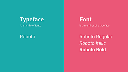
Contrast is an effective way to make your font stand out and add visual interest to your design. Use contrasting font styles, such as pairing a serif font with a sans-serif font, or use contrasting font weights, such as pairing a bold font with a thin font.
Avoid Too Many Fonts
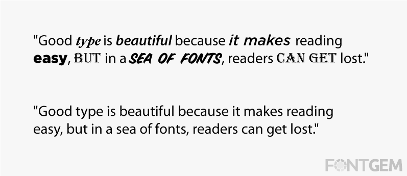
Using too many fonts in a design can be overwhelming and distracting. Stick to two or three fonts at most, and make sure they complement each other and work well together.
Pay Attention to Legibility
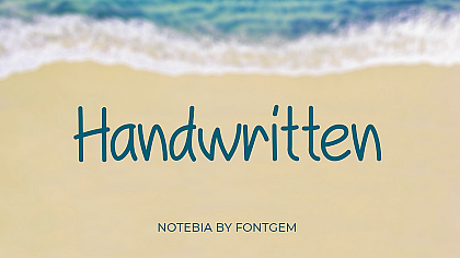
The most important aspect of a font is its legibility. Make sure the font you choose is easy to read and doesn't strain the reader's eyes. Avoid using cursive or decorative fonts for body text, as they can be difficult to read in large blocks of text.
Test Your Font
Before finalizing your font choice, test it in different sizes and contexts to make sure it looks good and is legible. Test it on different devices and screens to ensure that it works well on all platforms.
Don't Be Afraid to Experiment
While it's important to follow the above tips, don't be afraid to experiment with different fonts and styles. You may find a font that works perfectly for your design that goes against some of the traditional rules.
In conclusion, selecting the right font is critical in creating a beautiful and effective design. By considering the purpose of your design, keeping it simple, using contrast, avoiding too many fonts, paying attention to legibility, testing your font, and experimenting, you can create stunning designs that make an impact.
When selecting a font for your design, it's important to consider the context in which it will be used. For example, if you're designing a logo or branding materials, you'll want to choose a font that reflects the tone and personality of the brand.
Similarly, if you're designing a website, you'll want to choose a font that is easy to read on screens and works well in different sizes. It's also important to consider the audience you're designing for.
If you're designing for a younger audience, you may want to consider using playful or bold fonts, while a more formal audience may require a more traditional font choice.
By considering the context and audience of your design, you can choose a font that not only looks great but also effectively communicates your message to your intended audience.
In addition to the previous tips, here is some more practical advice and details for selecting and using the right font in design:
Understand Font Categories
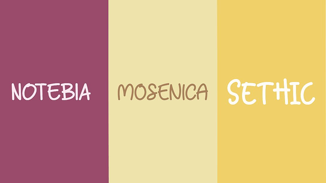
Fonts can be categorized into different styles, such as serif, sans-serif, script, display, and decorative. Each category has its own characteristics and purposes. Serif fonts, with their small decorative strokes, are often associated with formality and tradition, making them suitable for print materials like books and newspapers.
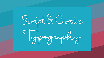
Sans-serif fonts, on the other hand, are more modern and often used for digital platforms and designs. Script fonts mimic cursive handwriting and convey elegance and sophistication. Display and decorative fonts are more unique and attention-grabbing, but they should be used sparingly for headlines or special design elements.
Consider Font Pairing
Font pairing refers to the combination of two or more fonts in a design to create visual harmony. When pairing fonts, it's important to choose fonts that complement each other while providing enough contrast.
One common approach is to pair a serif font with a sans-serif font. This combination balances elegance and readability. Another option is to pair fonts with contrasting weights, such as a bold font with a light or regular font. Experiment with different combinations to find the right balance for your design.
Take Hierarchy into Account
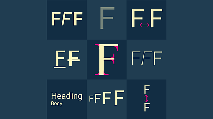
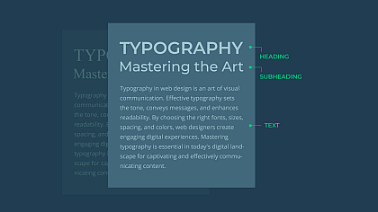
In design, establishing a visual hierarchy helps guide the reader's eye and prioritize information. Fonts play a crucial role in creating this hierarchy. Use font variations, such as size, weight, and style, to differentiate between headings, subheadings, and body text.
Headings can be bolder and larger to grab attention, while body text should be smaller and easier to read. Consistency in font choices throughout your design also helps create a sense of unity and cohesiveness.
Consider Cultural and Branding Considerations
Fonts can evoke specific emotions and cultural associations. When designing for a specific audience or target market, consider the cultural context and any existing brand guidelines. Different cultures may have preferences or associations with certain fonts, so it's important to research and choose fonts accordingly.
Additionally, established brands often have their own typography guidelines to maintain consistency and reinforce their brand identity. Ensure that the fonts you choose to align with the brand's personality and values.
Accessibility and Inclusivity
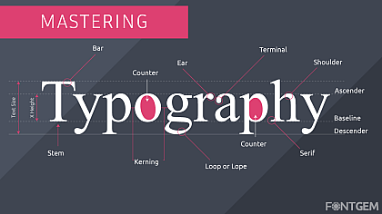
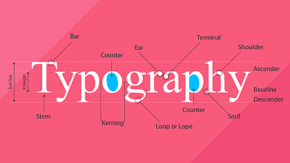
Designing with accessibility in mind is crucial to ensure that your content is accessible to all users, including those with visual impairments or reading difficulties. Select fonts that are legible and easy to read, even at smaller sizes. Pay attention to factors like letter spacing (kerning) and line height (leading) to improve readability.
Additionally, consider offering alternative formats, such as providing transcripts or alternative text for images, to accommodate users who may rely on assistive technologies.
Finalize and Refine
Once you have selected your fonts, make sure to fine-tune their usage. Adjust the tracking (letter spacing) and leading (line-height) to optimize legibility and visual appeal. Consider the alignment and spacing between different elements to create a balanced composition.
Regularly review and refine your design, seeking feedback from others, and making adjustments as necessary.
Remember, selecting the right font is not a rigid process, but rather a creative and iterative one. Trust your instincts, experiment with different combinations, and use the principles of design to guide your decision-making process.
With practice and attention to detail, you'll develop a keen eye for choosing fonts that enhance your designs and effectively communicate your message.

