

The Art of Kerning: How to Space Your Letters Like a Pro
Typography is an essential element of graphic design, and the spacing between letters plays a critical role in creating a visually appealing and readable design. Kerning is the process of adjusting the spacing between individual letters to achieve a balanced and visually appealing design.
Discover the art of kerning and provide tips and tricks for spacing your letters like a pro.
What is Kerning?
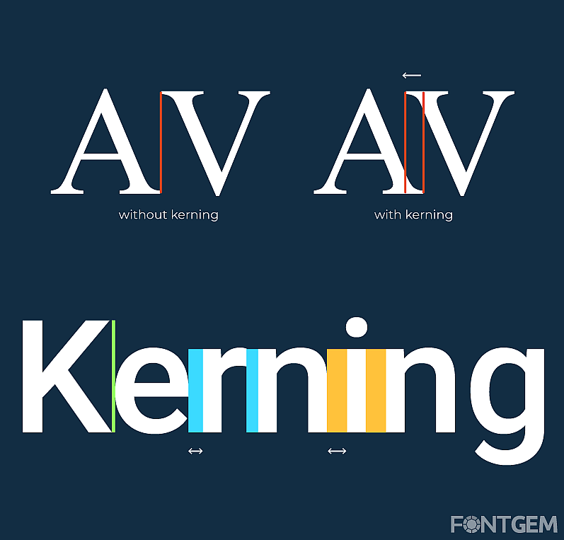
Kerning is the process of adjusting the spacing between individual letters in a word to improve its readability and visual appeal. It involves adjusting the space between pairs of letters to create a balanced and visually appealing design. Kerning can help improve the legibility of a word, reduce visual distractions, and make the text more aesthetically pleasing.
Kerning Techniques
Optical Kerning: Optical kerning is the process of adjusting the spacing between letters based on their visual appearance rather than their actual spacing. This technique involves adjusting the space between letters to achieve a balanced and visually appealing design. This technique is best suited for headings and titles, where the emphasis is on the overall visual appearance of the text rather than its legibility.
Metric Kerning: Metric kerning is the process of adjusting the spacing between letters based on their actual spacing. This technique involves adjusting the space between letters to create a consistent and balanced design. Metric kerning is best suited for body text, where the emphasis is on legibility and readability.
Pair Kerning: Pair kerning is the process of adjusting the spacing between specific pairs of letters to create a balanced and visually appealing design. This technique is best suited for headings and titles, where specific pairs of letters may require additional or reduced spacing to create a visually appealing design.
Tips for Kerning
Start with the right font: Choose a font that is well-designed and has appropriate letter spacing. A font with uneven spacing between letters may require more kerning adjustments.
Consider the context: The spacing between letters may vary depending on the context in which the text is used. For example, headings may require more spacing between letters, while body text may require less.
Use a ruler or grid: A ruler or grid can help you measure the spacing between letters and ensure consistency across your design.
Adjust spacing manually: While some software programs may have automatic kerning features, manually adjusting the spacing between letters can often produce better results.
Take a step back: After adjusting the spacing between letters, take a step back and look at the overall design. Make adjustments as necessary to achieve a balanced and visually appealing design.
Kerning is an essential element of typography and can greatly improve the legibility and visual appeal of your designs.
By using techniques like optical kerning, metric kerning, and pair kerning, and following tips like choosing the right font, considering the context, using a ruler or grid, adjusting spacing manually, and taking a step back, you can achieve a balanced and visually appealing design that engages and communicates with your audience.
The Importance of Kerning
Kerning can make a significant difference in the legibility and visual appeal of your typography. Without proper kerning, your text may look cluttered and difficult to read.
Kerning is especially important for small text sizes or when using fonts with thin strokes, as the spacing between letters can become more noticeable.
Kerning in Digital Design: Kerning is not just for print design. It is also essential in digital design, including web design, app design, and social media graphics. Proper kerning can help your digital designs stand out and increase engagement with your audience.
Kerning Tools and Software: Many design software programs have automatic kerning features that adjust the spacing between letters based on the font and the specific context. However, it is still important to manually adjust the spacing when necessary to achieve the desired results. There are also online tools and resources available that can help you practice and improve your kerning skills.
Common Kerning Issues: Some common kerning issues include uneven spacing between letters, incorrect spacing between specific letter pairs, and inconsistent spacing throughout the text. By identifying and addressing these issues, you can improve the overall legibility and visual appeal of your typography.
Case Studies: Throughout the article, provide case studies or examples that demonstrate the impact of kerning on the legibility and visual appeal of typography. This can include before-and-after examples or comparisons of different kerning techniques.
The art of kerning requires both technical skills and an eye for design. By following the tips and techniques outlined in this article, you can improve the legibility and visual appeal of your typography and create designs that engage and communicate with your audience.
Remember to consider the context, use appropriate tools and software, and practice regularly to develop your kerning skills. With time and dedication, you can master the art of kerning and take your typography to the next level.
LEAVE A COMMENT
Categories
Recent Posts


0.0659