Best Watch Fonts: Typography That Stands the Test of Time
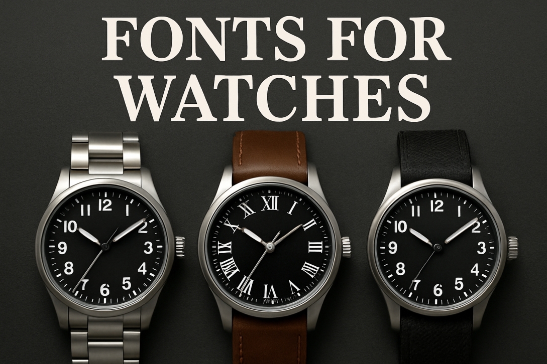
A watch's typography speaks before its hands ever move—the right font can whisper luxury, shout durability, or hum with minimalist precision. From the stately serifs on a Patek Philippe dial to the sporty digits of a Garmin, typefaces don't just tell time; they tell your watch's story.
For designers crafting watch faces or brands, choosing between classic fonts like Baskerville for heritage elegance or Eurostile for technical edge means understanding how letterforms measure up to milliseconds and milestones alike. Explore how the world's finest timepieces use typography as their silent partner in design at FontGem, where every curve and counter shapes time's visual rhythm.
Why Watch Typography Matters
A watch is more than a tool—it's a statement. The right font can make it feel:
✔ Luxurious (elegant serifs)
✔ Sporty (bold, digital styles)
✔ Vintage (retro-inspired scripts)
✔ Minimalist (clean, modern sans-serifs)
Here are the best typefaces for watch designs, branding, and watch faces.
Top Watch Fonts for Different Styles
1. Classic Luxury (Serif Fonts)
Ideal for high-end watch brands like Rolex or Patek Philippe.
- Baskerville – Timeless elegance with sharp serifs.
- Bodoni – High contrast, sophisticated look.
- Garamond – A refined, traditional choice.
Best for: Watch logos, packaging, and premium branding.
2. Sporty & Digital (Bold Sans-Serifs)
Great for fitness watches like Garmin or Casio.
- Helvetica Neue – Clean, versatile, and highly legible.
- Eurostile – Futuristic with a technical feel.
- DIN Next – German-engineered precision.
Best for: Digital watchfaces, sporty branding.
3. Vintage & Retro (Script & Display Fonts)
Perfect for heritage brands or nostalgic designs.
- Times New Roman – Classic newspaper-style authority.
- Optima – A mid-century modern favourite.
- Cooper Black – Playful 70s charm.
Best for: Limited-edition watches, retro-inspired dials.
4. Minimalist & Modern (Geometric Fonts)
For brands like Braun or Mondaine.
- Futura – Clean, geometric perfection.
- Avenir Next – Balanced and professional.
- Gotham – A no-nonsense, contemporary choice.
Best for: Smartwatches, sleek packaging.
How to Choose the Right Watch Font
- Match the Watch’s Personality – A dive watch needs a rugged font, while a dress watch calls for elegance.
- Legibility is Key – Even decorative fonts should be readable at small sizes.
- Consider the Medium – Watch dials need simple fonts; ads can be more stylised.
Time to Pick Your Perfect Typeface
Whether you’re designing a watch face, branding a watch company, or creating packaging, the right font sets the tone. Need more typography inspiration? Browse FontGem’s collection for fonts that make every second count.
For watch enthusiasts looking to elevate their timepiece with a touch of luxury, a Cartier leather strap offers the perfect blend of sophistication and durability. Whether you own a Tank, Santos, or Ballon Bleu, replacing the original band with a high-quality strap can completely transform your watch's aesthetic.
These premium straps come in various colours and finishes, from classic black calfskin to exotic alligator (without using real animal products), ensuring you find the perfect match for both formal occasions and everyday wear. The right strap not only enhances comfort but also preserves the timeless elegance that Cartier watches are known for.
FAQs
What’s the most popular watch font?
Helvetica (for modern watches) and Bodoni (for luxury brands).
Can I use free fonts for watch designs?
Yes, but premium fonts often have better kerning and special characters.
What font does Rolex use?
A custom serif typeface inspired by Garamond.
Best font for digital watch displays?
Eurostile or DIN Next for a tech-forward look.
Where can I find high-quality watch fonts?
Check out FontGem for professional typography options.

